

Bring in your own diagram
Turning a diagram drawn in Visio, a spreadsheet, an export from another tool, or a plain list of items and the items they belong to into a table the visual reads: what the table needs, choosing the diagram type, a worked example with no analysis method behind it, reshaping in Power Query, and loading it into Power BI.
What the visual needs from any source
The visual reads a table, not a drawing. Whether your items live in a Visio file, a slide, a spreadsheet, a database or another tool, they have to become rows in Power BI first. You do not need to know any of the analysis methods to do this. Every table needs three things:
- An ID for each item. Anything unique to it: 1, 2, 3, a code such as LIM-004, or a name. The visual calls this the Node ID, and each item a node.
- The ID of the item it connects to. In a hierarchy that is the item it belongs to, the one above it, which is what a Parent ID column holds. The visual calls this the Connected node. Leave it blank for an item at the top, or one that is not connected to anything.
- A name to show. The text drawn on each item, which the visual calls the Label.
Everything else is optional. A limit, the latest value, a status, an owner, a date or a link goes in a column of its own, and each can be shown when the item is selected, written beside it or used to colour it. A Node type column, which says what kind of item each row is, matters only when you want the symbols and rules of a particular method: Fault Tree Analysis, Reliability Block Diagram and Markov State Diagram all draw without one.
Which diagram type is it?
| If you have | Choose |
|---|---|
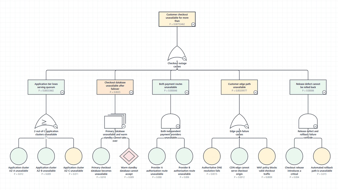
| A fault tree or cause tree: an event broken down through AND, OR and other gates | Fault Tree Analysis |
| A bow-tie, or a register of threats, barriers or controls, and consequences | Bow-Tie Risk Analysis |
| An event tree: a starting event followed by steps that succeed or fail, out to outcomes | Event Tree Analysis |
| A reliability block diagram: blocks in series and in parallel between an input and an output | Reliability Block Diagram |
| A safety case, assurance case or other argument made of goals, strategies and solutions | Goal Structuring Notation |
| A state transition diagram, a Markov chain, or a table of rates between states | Markov State Diagram |
| A hierarchy that is none of these, such as limits, KPIs or cost centres rolling up into one another | Fault Tree Analysis, with no Node Type column. See the example below. |
The diagram type is chosen in the editor, not in the data. If most of your node types belong to a different type, the Validation tab says which one.
An example with no method behind it
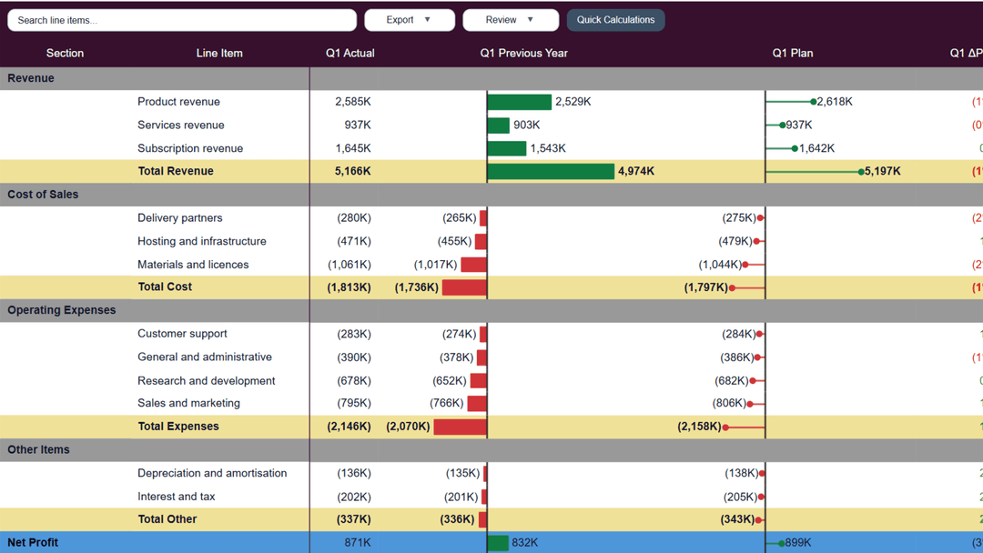
A risk team keeps its limits in a table. Each limit has a number, the number of the limit it rolls up into, a threshold, the latest reported value and whether it is breached. It is not a fault tree or any other method, but it is a hierarchy, and a hierarchy is all the visual needs.
| Limit ID | Parent Limit ID | Limit Name | Limit | Latest Value | Breach Status | Owner |
|---|---|---|---|---|---|---|
| 1 | Group market risk | 120 | 96 | Within limit | Chief Risk Officer | |
| 2 | 1 | Trading book VaR | 80 | 71 | Within limit | Head of Trading |
| 3 | 1 | Banking book interest rate risk | 40 | 25 | Within limit | Treasurer |
| 4 | 2 | FX VaR | 20 | 23 | Breached | FX desk |
| 5 | 2 | Rates VaR | 45 | 38 | Within limit | Rates desk |
| 6 | 2 | Equity VaR | 15 | 10 | Within limit | Equity desk |
| 7 | 3 | EVE sensitivity | 30 | 18 | Within limit | ALM |
| 8 | 3 | NII sensitivity | 12 | 7 | Within limit | ALM |
| 9 | Large exposure limit | 250 | 190 | Within limit | Credit Risk |
Limit 9 rolls up into nothing, so it is drawn on its own beside the tree.
Put the columns in the visual
Drag Limit ID, Parent Limit ID, Limit Name, Owner and Breach Status into Data fields. Drag Limit and Latest Value into Values and set each to Don't summarize.
Choose Fault Tree Analysis
Open the editor with More options (…) → Edit and select Fault Tree Analysis on the left. It draws a hierarchy top to bottom. With no Node Type column every item is a plain box and only loops and out-of-range values are checked, so no fault tree rules get in the way, and the editor reads Validation clear.
Map three columns
On the Data Mapping tab, set Node ID to Limit ID, Connected node to Parent Limit ID and Label to Limit Name. Columns called ID, Parent ID and Label would map themselves.
Colour the breaches
Under Appearance → Conditional formatting, choose Add rule: When Breach Status, Is Equal to, Value Breached, Colour Node fill, and a red. Turn on Labels → Legend → Show legend so readers know what the colour means.
Show the numbers
Under Labels → Value annotations, add rows for Limit and Latest Value to write them beside each box. Select a limit on the report and the Node Inspector lists the rest of its row, such as its owner.
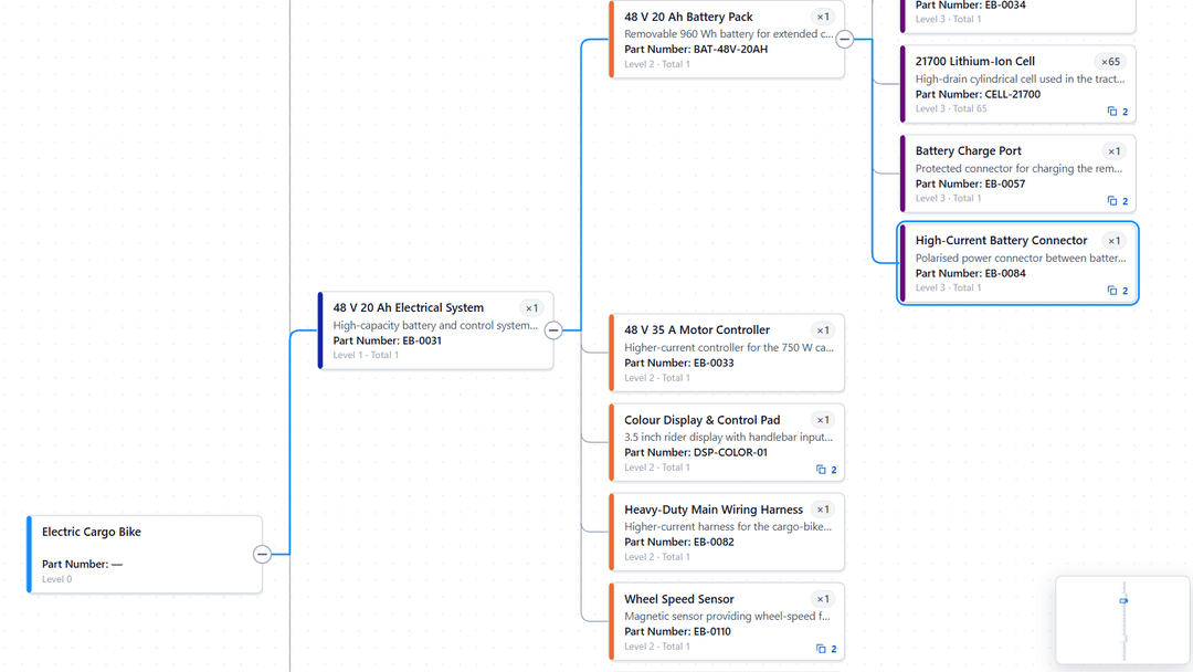
The same steps work for any list of items with an ID and the ID of the item they belong to: KPIs rolling up into a scorecard, cost centres, controls grouped under objectives, or parts in a product structure. If you keep every reported value over time, put the reporting date on a slicer so the diagram shows one date at a time.
From a drawing
A diagram that exists only as a picture, such as a Visio or PowerPoint drawing, is typed out as a table once. Keep the drawing open beside Excel, or beside Enter data in Power BI, while you work.
Give every box a Node ID
Short and unique, such as 1, 2 and 3, or TOP, G1 and P1. Writing the IDs onto a printout or into the shapes makes the rest easier.
Write one row for each box
Its Node ID and its text, in columns called Node ID and Label, and its node type in a Node Type column when the diagram follows one of the methods.
Add the lines
In a Connected Node ID column, write the Node ID at the other end of each line, on the row of the box the line belongs to. A box with two lines needs two rows: copy its row and change Connected Node ID. A box with no node to name, such as the top of a fault tree or the output of a reliability block diagram, keeps its row with Connected Node ID blank.
Put each line on the end the diagram type expects
A fault tree or event tree row names the node before it, such as a basic event naming the gate above it. A bow-tie, reliability block diagram, goal structure or Markov row names the node after it. If your table is the other way round, change Reads as on the Data Mapping tab instead of retyping it.
Add your values
Probability, status, owner and any other detail, in columns of their own. A node's values can go on one of its rows or on all of them, as long as its rows do not give different values.
A fault tree with a top event TOP over an OR gate G1, and two basic events under G1, is the four rows in Build your first diagram.
From a spreadsheet or another tool
Most analysis and diagramming tools can export to Excel or CSV. Look at what one row of the export describes. If it is not already one row per connection, reshape it in Power Query, which opens when you select Transform Data while loading it.
| The export has | What to do in Power Query |
|---|---|
| One row per item, with a column naming its parent or its next item, such as ID and Parent ID | Nothing. This is already the shape the visual reads. |
| One row per barrier, with its threat or consequence | Nothing. Bow-Tie Risk Analysis reads a register as it is. See Bow-tie register. |
| A list of nodes, and a separate list of connections | Rename the columns of the connection list so its two ends are called Node ID and Connected Node ID, then select Home → Append Queries to stack the two lists in one table. A node's type and text on one row and its connections on other rows still make one node. |
| All the children of a node in one cell, such as G2; G3 | Select the column and choose Transform → Split Column → By Delimiter. Under Advanced options, split into Rows, so each child gets a row of its own. |
| A matrix of rates, with the state a transition leaves down the side and the state it reaches across the top | Name the first column State ID, select it and choose Transform → Unpivot Columns → Unpivot Other Columns. Rename Attribute to Connected State ID and Value to Transition Rate. Then, on Transition Rate, choose Number Filters → Greater Than and enter 0, which removes empty cells, zeros and the negative totals some matrices keep where a state meets itself. |
A state that nothing leaves, such as an absorbing state, has no row left after a matrix is unpivoted. Append a list of the states, so every state keeps a row of its own.
Clean-up that prevents most problems
- Trim the ID columns with Transform → Format → Trim. An ID with a stray space does not join.
- Where a spreadsheet writes a value once and leaves the cells below it empty, as merged cells do, select the column and choose Transform → Fill → Down.
- Give number columns a number type, such as Decimal Number. A number stored as text is not bound to a numeric role.
- Store percentages as fractions, 0.96 rather than 96.
- Keep the node type wording your tool uses. Wording the visual does not recognise is mapped once under Node type values on the Data Mapping tab.
Loading it into Power BI
Get the data
In Power BI Desktop, select Home → Get data and choose where your data lives. Any source Power BI connects to works, including Excel, Text/CSV, SharePoint lists, SQL Server and other databases, Dataverse and web sources: the visual only sees the finished table, so what matters is its shape, not where it comes from. A small table can be typed straight in with Home → Enter data.
Reshape it if it needs it
In the Navigator, tick the table and select Transform Data instead of Load. Make the changes above, then select Close & Apply.
Add the visual and fill the wells
Put IDs, types, labels and other text in Data fields. Put numbers in Values and set each one to Don't summarize.
Choose the diagram type and check the mapping
Select the visual, open More options (…) and choose Edit. Pick the diagram type on the left, check that each column is mapped to the right role on the Data Mapping tab, and read the Validation tab.
When the source changes, refresh the report and the diagram is rebuilt from the new rows. As long as the column names stay the same, nothing needs mapping again.
The table each diagram type reads
| Diagram type | One row is | Start with | Then add |
|---|---|---|---|
| Fault Tree Analysis | A node, naming the node above it. | Node ID, Parent ID, Node Type, Label | Probability, Failure Rate, Vote Threshold, Status |
| Bow-Tie Risk Analysis | A connection, naming the next node. In a register, one barrier. | Node ID, Connected Node ID, Node Type, Label. In a register: Threat, Barrier, Consequence, Top Event | Order, Status, Health |
| Event Tree Analysis | A node, naming the node before it. | Node ID, Connected Node ID, Node Type, Relationship Type, Label | Probability on each branch, Frequency on the initiating event |
| Reliability Block Diagram | A connection, naming the next block. | Node ID, Connected Node ID, Node Type, Label | Reliability, Availability, Vote Threshold, Vote Input Count, Status |
| Goal Structuring Notation | A connection, naming the element it leads to. | Node ID, Connected Node ID, Node Type, Relationship Type, Label | Status, Decorators, Module Reference |
| Markov State Diagram | A transition, from the state it leaves to the state it reaches. | State ID, Connected State ID, State Label | Transition Type, Transition Rate, State Probability, Status |
| Any other hierarchy, drawn as Fault Tree Analysis | An item, naming the item it belongs to. | ID, Parent ID, Label | Any values you want to show or colour by |
Each diagram type's Preparing data page lists every column it reads, which row each value goes on, and a complete worked example.