

Ataytis Motion
A ranking that changes over time is a story, and a static chart tells it badly. Ataytis Motion plays it — eleven chart types, one animation engine, and an editor that shows the result on your own data while you build it.
30-day free trial. Licensed and billed through Microsoft Marketplace.
Sample report
Six chart types, one dataset
The same figures drawn several ways, playing in the browser exactly as they would in a report. Let a race finish, then look at the same data as a bump chart.
The bar chart race, done properly
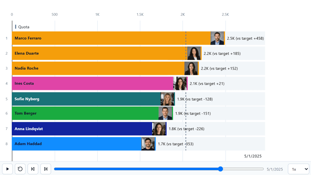
Bars overtake each other, labels follow their marks, and the value axis rescales as the numbers grow. Horizontal or vertical, with images on the bars and the frame caption in whichever corner suits the layout.
Rank history you can follow
A bump race draws each competitor as a line through the rankings, so the question changes from who is winning to who has been climbing. The same data as the bar race, answering something the bar race cannot.
Value history, revealed as it happened
Line and area charts draw themselves forward through the axis rather than appearing complete, so the shape of the history arrives in the order it happened instead of being read off a finished picture.
Two measures, two encodings
Line and column puts a volume on the columns and a rate on the line, animating both together. The pairing every monthly report needs and the standard visual makes hard work of.
Composition that moves
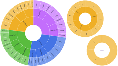
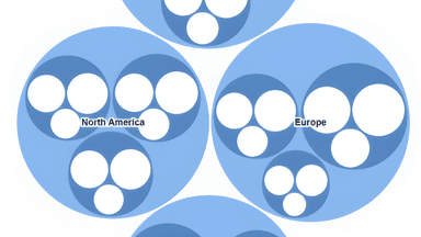
Donut, pie, funnel, treemap and waterfall animate part-to-whole change, so a shifting mix reads as a shift rather than as two static pictures a reader has to compare from memory.
A gauge that arrives at its number
Progress against a target, with up to four goals marked on the arc and optional minimum and maximum from your own measures. Category is optional here — a single value needs no dummy field to group by.
Why it is different
Built to sit in a real report
Not a widget bolted onto the page — a visual that reads your data, follows your styling, and answers to your filters.
Eleven Chart Types, One Engine
Bar race, lollipop race, leaderboard, bump race, line and area, line and column, donut and pie, funnel, treemap, waterfall, and gauge. They share the same animation engine, the same data model and the same editor, so switching chart type keeps your fields, colours and labels rather than starting again.
An Editor That Shows Your Data
Almost every setting lives in a full-canvas editor rather than the format pane, with a live preview driven by the data actually bound to the visual and the same renderer the report uses. What you approve in the editor is what the report draws.
Animation Driven by Your Axis
Drop a date or period field into Axis and the chart steps through it. Without one it draws a single static ranking, which is a legitimate way to use it. Playback speed, easing and frame captions are yours to set.
Sparse Data, Handled Deliberately
Real series have gaps. A measure missing from a frame can be excluded, treated as zero, carried forward from the last known value, or interpolated between known frames — chosen per report rather than assumed, because each of those is right for a different kind of data.
A Leaderboard That Reads Like a Table
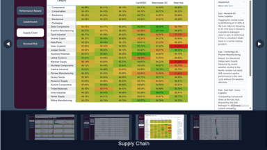
Ranked rows with optional headers, portraits, rank movement and up to eight extra measures. Numeric columns hold an authored width while the category column takes the rest, and on a narrow canvas trailing columns collapse before the name and the value do.
Notes Pinned to the Moment
A story can be told over any chart type, with notes attached to points in the animation. The chart stops being a loop somebody watches once and becomes the thing that explains what happened, at the moment it happened.
Images Without an External Call
Racers can carry a logo or a portrait, covering or fitting their shape, placed at the mark end, the baseline or the label. Certification forbids fetching anything from the web, so images travel inside the report as inline data; anything else falls back to an initials monogram in the racer’s own colour.
Build Before You Buy
Power BI Desktop always renders, with a watermark, so the whole visual can be designed, demonstrated and reviewed with no trial and no sign-up. A licence is needed only to publish the report for others to read.
The full technical detail lives in the documentation.
Getting started
From install to published report
Install once, then it is there every time you build a report.
Install from Marketplace
Get Ataytis Motion from Microsoft Marketplace inside Power BI Desktop, or from the listing in a browser. It is Microsoft-certified, so it makes no external calls and can be used in reports with strict data policies.
Add three fields
A Category to race, a Measure to size it, and an Axis field for the frames to step through. That is enough for a bar race. Everything else — targets, minimums, extra measures, images, tooltips — is optional.
Open the editor
The Edit action in the visual header opens a full-canvas editor with a live preview of your real data. Pick a chart type on the left, choose what you are editing along the top, and adjust it on the right.
Licence it to publish
Desktop always renders, with a watermark, so the visual can be designed and demonstrated before anyone pays. A licence is only needed once the report goes to the Power BI Service for other people to read. Thirty days free, billed by Microsoft.
Pricing
Priced per user, with volume discounts
Every person who creates, views, or interacts with a report containing Ataytis Motion needs a licence. The first month is free on every plan.
Up to 20 users
motion-pro (1-20)
Monthly$1.99per user
Annual$19.99per user
Up to 100 users
motion-pro (21-100)
Monthly$1.79per user
Annual$17.99per user
Up to 200 users
motion-pro (101-200)
Monthly$1.49per user
Annual$14.99per user
Up to 500 users
motion-pro (201-500)
Monthly$1.29per user
Annual$12.99per user
500 users or more
motion-pro 500+
Monthly$0.99per user
Annual$9.99per user
Organisation-wide licensing, site-wide licensing, and custom volume discounts are available — ask for a tailored quote.
Prices are per user, in US dollars, purchased and billed by Microsoft through Marketplace rather than through AtaytisTech. Paying annually works out at roughly two months free against the monthly rate.
Questions
Frequently asked questions
Certified, and ready for your next report
Point it at your own data in Power BI Desktop, with no trial and no sign-up. If it does not tell the story better than a static chart, you have lost nothing.