
Build your first diagram
Type a four-row table into Power BI, turn it into a fault tree with no manual mapping, and check the three settings that matter on your own data.
The table
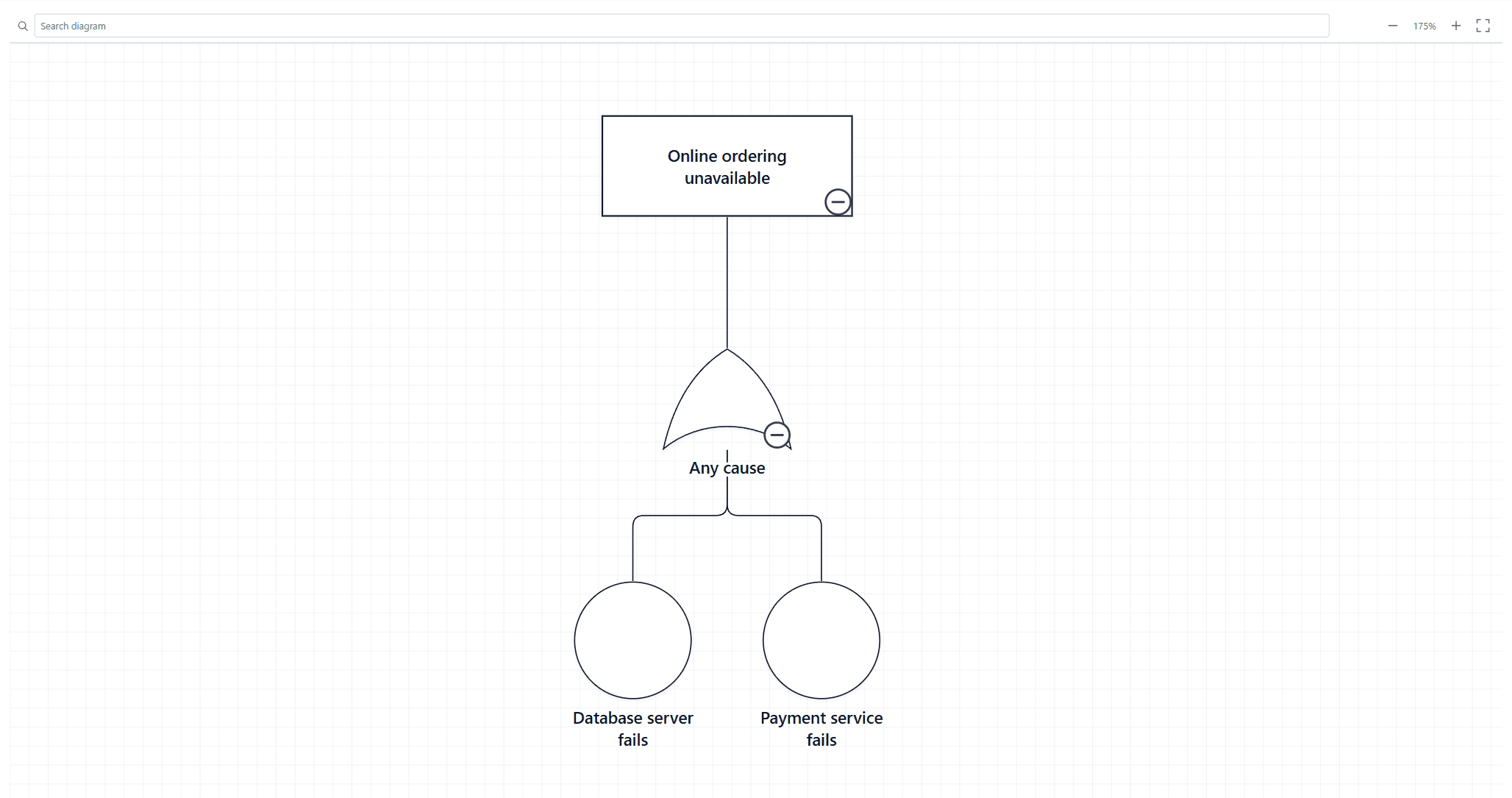
This fault tree uses five columns. Every column name is one the visual recognises, so nothing needs mapping by hand.
| Node ID | Parent ID | Node Type | Label | Probability |
|---|---|---|---|---|
| TOP | Top Event | Online ordering unavailable | ||
| G1 | TOP | OR Gate | Any cause | |
| P1 | G1 | Basic Event | Database server fails | 0.01 |
| P2 | G1 | Basic Event | Payment service fails | 0.01 |
From empty visual to diagram
Put the table in Power BI
In Power BI Desktop, select Home → Enter data. Type the column names over Column1, Column2 and so on, type the four rows beneath them, name the table and select Load. A table kept in Excel is loaded the same way through Home → Get data.
Check that Probability is a number
Select Probability in the Data pane. On the Column tools ribbon, set Data type to Decimal number if it is not already.
Add the visual
Select Ataytis Assurance in the Visualizations pane. Until it has fields it reads: Add your data fields, then select Edit on the visual to choose a diagram and customise its appearance and behaviour.
Bind the structural columns
Drag Node ID, Parent ID, Node Type and Label into Data fields.
Bind the value column
Drag Probability into Values and set it to Don't summarize.
Open the editor
Select the visual, open More options (…) and choose Edit. Check that Fault Tree Analysis is selected in the Diagram type list on the left.
Check the mapping
On the Data Mapping tab, Node ID is mapped to Node ID, Parent ID to Connected node, Node Type to Node type, Label to Label and Probability to Probability.
Read the validation status
The editor header shows the error or warning count. Open the Validation tab to see what the fault tree rules found.
Go back to the report
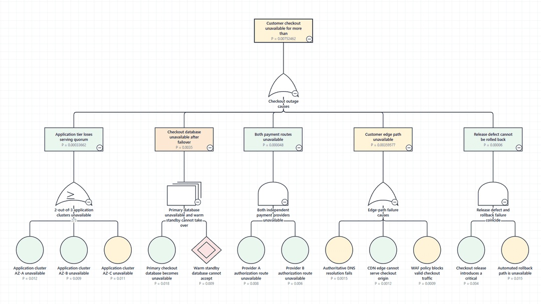
Select Back to report. The fault tree is drawn on the page, and selecting a node filters the other visuals to its rows.
Why nothing needed mapping
Each column name is one the visual looks for. Other common names bind too, such as Event ID to Node ID, Parent to Connected node, Type to Node type and Description to Label, so a table that uses those draws the same way. Probability binds because the column is numeric; a text column with the same name is left unmapped rather than mapped to a role it would fail.
Node type values are matched loosely. OR Gate, or gate, OR_GATE and or-gate all read as the same gate.
Three settings to check on your own data
| Setting | Why it matters |
|---|---|
| Diagram type | The list on the left of the editor. The data cannot choose it, although the visual says when your node types match another type better. |
| Connection column → Reads as | On the Data Mapping tab. Decides whether Connected node is the node before or after the row. Set the wrong way, the diagram draws backwards. |
| Diagram → Show | At the top of the Data Mapping tab when the table holds two or more Diagram IDs. Decides which diagram is drawn. |