Layout and appearance
The Diagram and Appearance tabs: automatic layout, spacing, colours, style presets, conditional formatting, and node type and individual node styling.
Automatic layout
Node positions are always calculated. Nodes cannot be dragged; the result is controlled through orientation, density, spacing and Order.
| Setting | Options |
|---|---|
| Orientation | Top to bottom, Bottom to top, Left to right, Right to left. Only the orientations the diagram type supports are listed. |
| Density | Compact, Comfortable, Spacious. |
| Connector routing | Orthogonal, Curved, Straight. A notation profile may fix it. |
| Dimensions and spacing | Range |
|---|---|
| Node width | 72–480 px |
| Node height | 36–280 px |
| Layer spacing | 20–360 px |
| Node spacing | 8–240 px |
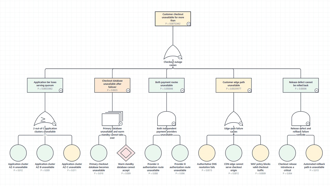
Map Order to set the sequence of nodes that sit side by side. On a hierarchy such as a fault tree, the nodes beneath each parent are kept together whether or not Order is mapped, so one parent's inputs are never interleaved with another's.
Colours
Canvas, Node fill, Node border, Connectors, Selection and Warnings. In Power BI high contrast mode, the host's colours replace these.
Shape and typography
| Setting | Options |
|---|---|
| Font | Segoe UI, Arial, Tahoma, Verdana, System sans-serif |
| Border width | 0–8 px, or the range the notation profile allows |
| Corner radius | 0–48 px. A notation profile may fix it. |
| Connector thickness | 0.5–8 px |
Style presets
| Preset | Result |
|---|---|
| Classic | Plain outlines and generous spacing. |
| Modern | Softer corners, lighter connectors, more whitespace. |
| Compact | Tighter spacing and smaller text for dense diagrams. |
Applying a preset sets border width, corner radius, connector width, font, density, label size and label lines once. Changes made afterwards stay. Settings the notation profile fixes are left as the profile defines them.
Conditional formatting
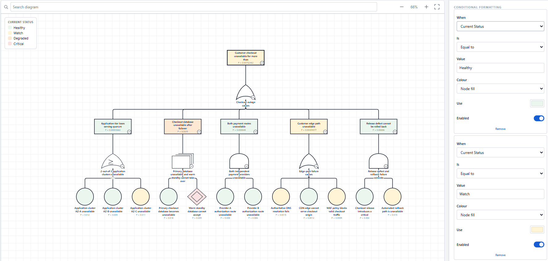
Rules colour nodes and connectors from their values. Choose Add rule and set each part of the rule.
| Part | Options |
|---|---|
| When | Any value on the diagram: a mapped role such as Status or Probability, or another bound column. |
| Is | Equal to, Not equal to, Greater than, Greater than or equal to, Less than, Less than or equal to, Between, Blank, Not blank |
| Value and And | The value to compare with. Greater than, Less than and Between compare numbers. Equal to compares text exactly, so 1 and 01 are different values. |
| Colour | Node fill, Node border, Node label, Status badge, Connector, Connector label |
| Use | The colour to apply. |
Each colour target takes the first enabled rule in the list that matches. Put more specific rules above general ones. Rules for different targets, such as a fill rule and a border rule, can both apply to the same node. Turn a rule off with Enabled, or delete it with Remove.
Node types
Style every node of one type at once. Pick the type under Add a type; types present in the diagram are marked (in use). For each type, set a Display name, Fill, Border and Text colours, the Symbol, a size of its own and an icon.
The Symbol list starts with Profile default and the notation's own symbols for that type, then plain shapes: Rectangle, Rounded rectangle, Circle, Ellipse, Diamond, Hexagon, Pill, Parallelogram, Triangle and House. Where a type has no symbols of its own, the list is called Shape and holds the plain shapes. Set its own size gives the type a width and height from 12 to 600 px, and Enabled turns its styling off without removing it.
The display name changes what is shown on the diagram, never what the node means.
Individual nodes
Override the fill, border, size or icon of a single node, chosen by its label. Up to 50 overrides can be added. Overrides are stored against the node's identifier, so they survive a data refresh, and they apply after conditional formatting.
Icons and your own artwork
Node types and individual nodes can carry an icon from the bundled set, Warning, Fault, Note, Locked, Goal or Component, positioned at a corner, centred, or above or below the symbol, at 6–64 px and in any colour. To use your own artwork, paste an SVG into Your own symbol. It is sanitised before it is saved, and Remove artwork takes it off again.
Which setting wins
Notation profile
Values the active profile fixes.
Your settings
Everything the profile leaves free, and limited settings within their bounds.
Conditional formatting
Colours from matching rules.
Individual nodes
An override on a single node.
High contrast
Power BI's high contrast colours replace authored colours.