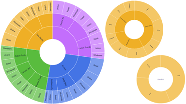
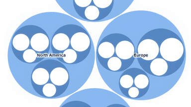
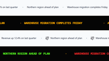
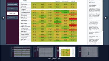

Labels, legend and summary
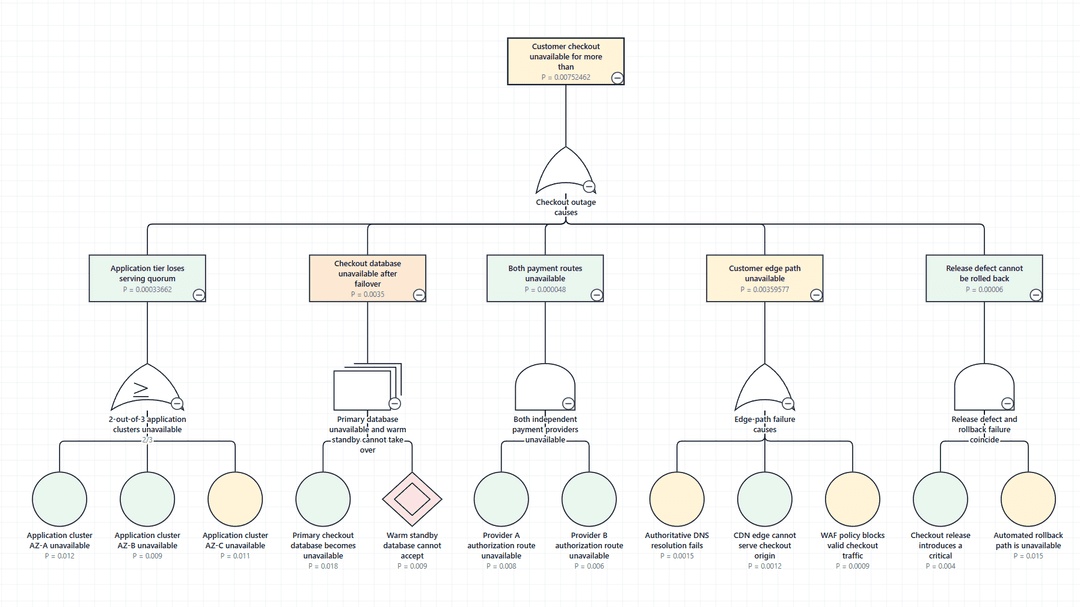
The Labels tab: what text is drawn and where, value annotations beside each node, the colour legend and the summary strip.
Label content
Turn the Primary label and Secondary label on or off. They show the columns mapped to Label and Secondary label.
Label placement
| Setting | Options |
|---|---|
| Position | Follow notation, Inside the symbol, Below the symbol |
| Label width | 60–300%. Widen it when labels kept inside narrow symbols, such as gates, are cut short. |
| Connector label width | 60–300%. Changes where connector labels wrap without moving any symbols. |
Readability
| Setting | Options |
|---|---|
| Font size | 8–32 px |
| Maximum lines | 1–12 |
| Overflow | Wrap, Ellipsis |
| Bold, Italic, Underline | On or off |
| Text colour | Replaces the text colour of every symbol. |
Value annotations
Annotations write bound values beside each node, outside the symbol so the notation stays recognisable. None are shown by default. Choose Add value row to add up to 12 rows.
| Setting | Options |
|---|---|
| Row | The value to show. |
| Position | Below, Above, Right, Left |
| Show field name | Shows the field name with the value. |
| Use status colour | Colours the row with the node's status badge colour from conditional formatting. |
| Enabled | Turns the row off without removing it. |
Values use the format string from the model, so 0.942 formatted as a percentage reads 94.2%. A node with no value for the field shows no row.
Legend
The legend is built from the enabled conditional formatting rules, so it always matches the colours on the diagram. Turn on Show legend, then set its Position in any corner, Title, Arrangement (Stacked or In a row), Text size (7–24 px), and whether it has a Background, Border and Shadow.
The legend stays in its corner and readable while the diagram is zoomed or panned. With no rules enabled it has nothing to show, and the editor says so.
Summary strip
The summary strip counts nodes by Status and shows the result above or below the diagram. Turn on Show summary and choose Top or Bottom. Nodes with no status are counted under No data rather than left out.
Each count is a button. Selecting it highlights those nodes and fades the rest; selecting it again clears the highlight. Nothing is filtered, so the diagram keeps its shape and no Power BI filter is applied.