Gauge
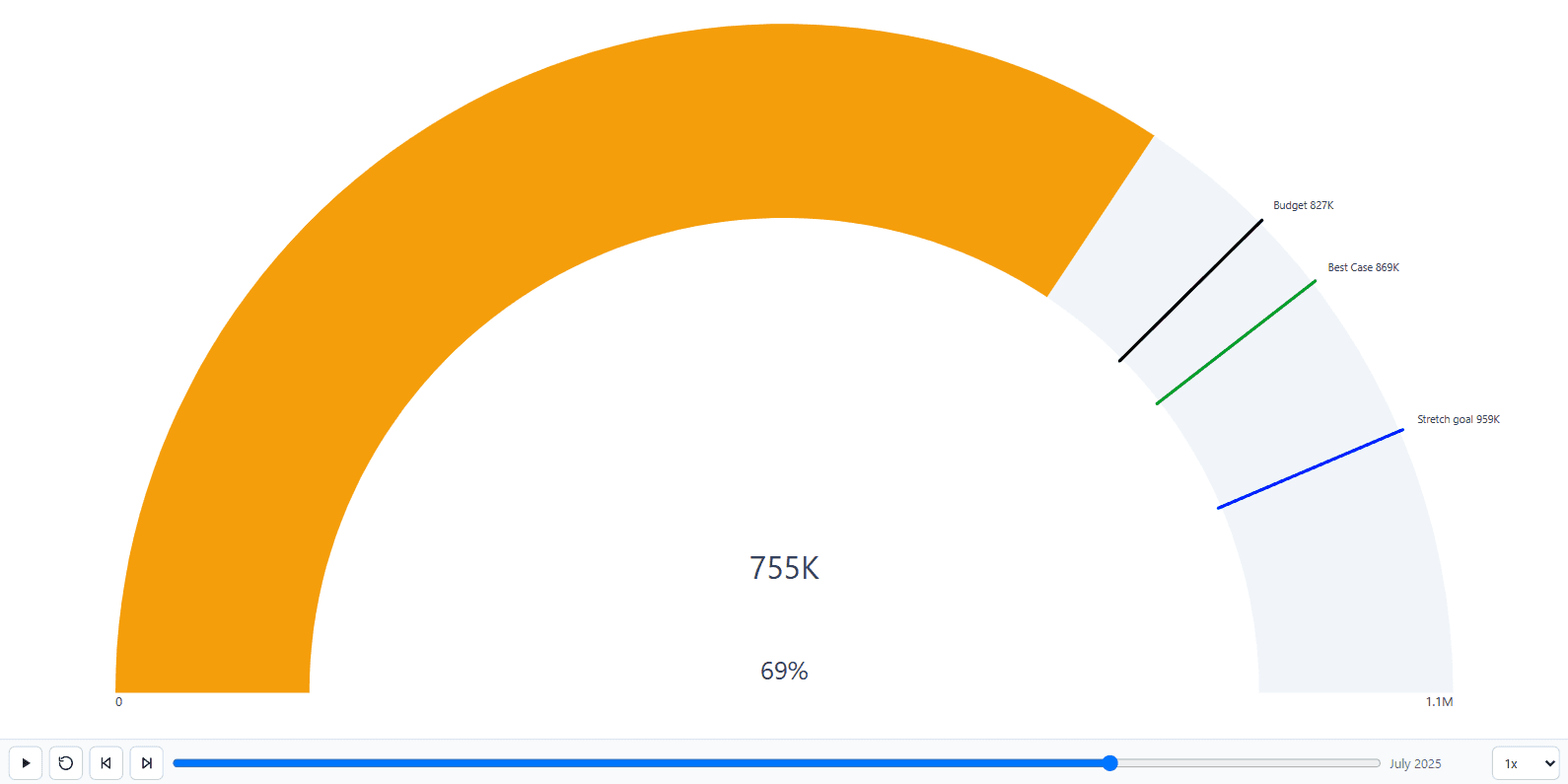
One dial for the current measure, with bounds, a target, up to four goals, and status colours that follow them.
A single value on a dial
The gauge shows one measure against a range. Category is optional here: with no Category the visual creates a single aggregate series, so a standalone gauge needs no dummy field to group by.
| Well | What it does on a gauge |
|---|---|
| Measure | The value the needle reads. |
| Minimum | The lower bound of the arc. |
| Maximum | The upper bound. |
| Target / Comparison | A target marker. |
| Gauge goals | Up to four goals marked on the arc, in field order. |
Four goals, not one
The gauge takes up to four goals at once. Each can be a number typed in or a bound field, and each has its own colour, label and marker style.
For how this compares with the native gauge's single target and the usual workarounds, see Power BI gauge with multiple targets.
| Marker style | How it draws |
|---|---|
| Line | A line across the arc at that point. |
| Needle | A needle outside the arc. |
| Band | A shaded band from that point on. |
How a goal read from a field is resolved
A goal bound to a field can take one of three readings, which matters as soon as the goal itself changes over the run.
| Reading | What it uses |
|---|---|
| Final value | The goal as at the last frame. |
| Total across the run | The goal summed over every frame. |
| Value at each frame | The goal as it stood in that frame. |
Status colours
The dial can change colour at a percentage of its range, or at a goal. Tying the change to a goal rather than a percentage means "amber once we reach budget" stays true as the budget moves.