Build your first chart
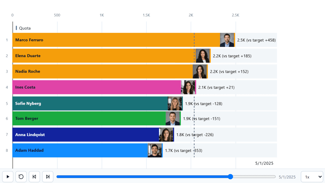
Three fields to a working bar race, then the two settings worth checking before you go any further.
From empty visual to running race
Add the visual and size it
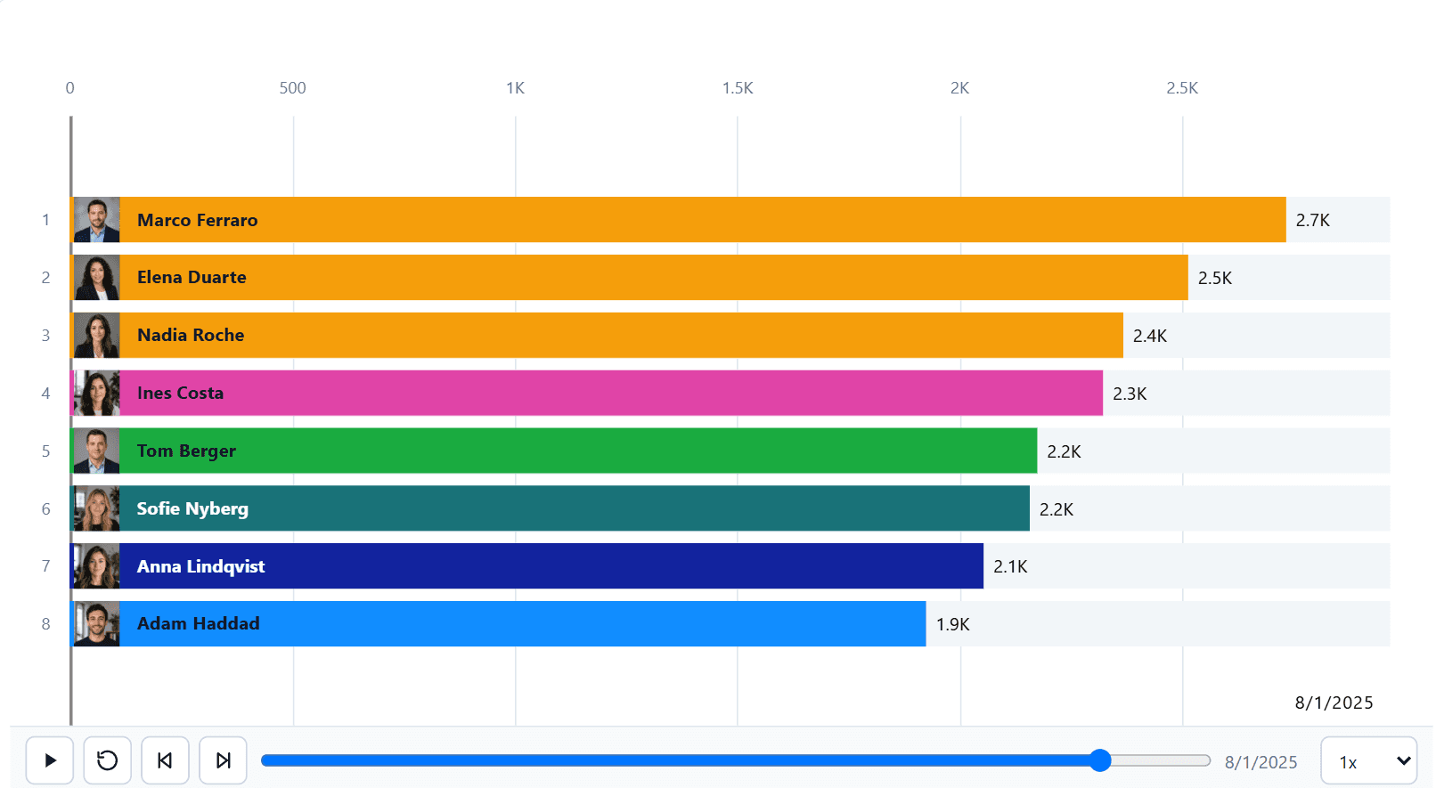
Place Ataytis Motion on the canvas. A race needs width for the bars and their labels; a shape close to 16:9 is a reasonable start.
Assign Category and Measure
Category is what competes — a product, a country, a salesperson. Measure is the number that sizes it.
Assign Axis
The field the animation steps through, usually a date or period. Bind the date field itself rather than the automatic date hierarchy.
Check the value calculation
Open the editor and look at Chart, then Value calculation. The default is Cumulative total, which suits a per-period measure rather than one that already reports a total.
Set the frame count
Decide how many categories are on screen at once. Those outside that number stay part of the ranking, so a category can enter and leave the visible set as the animation runs.
Press play
The transport controls sit under the chart by default. Drag the timeline to check the start and the end before you show anyone.
The two settings to check first
Both have sensible defaults that are wrong for a good proportion of real data, and both produce a chart that looks plausible while saying something untrue.
| Setting | Why it matters |
|---|---|
| Value calculation | Decides whether each frame shows that period alone or a running total. A running total of a subscriber count restates it every month and can only ever climb. |
| Missing values | Decides what happens when a category has no row for a period. The default excludes it, so a line stops where its data stops rather than falling to zero. |