Can a Power BI gauge show more than one target?
No. The built-in gauge has exactly one target. It has four inputs, Value, Minimum, Maximum and Target value, and only the last one draws a target line. Minimum and Maximum set the ends of the scale; they are not extra targets.
There are workarounds, and some are perfectly good: letting readers choose which target to compare against, one gauge per target, or switching to a bar chart, which can carry as many target lines as you like. Paginated reports have a gauge with several pointers. And if the dial itself matters, our Ataytis Motion visual puts up to four goals on one arc.
What we tested
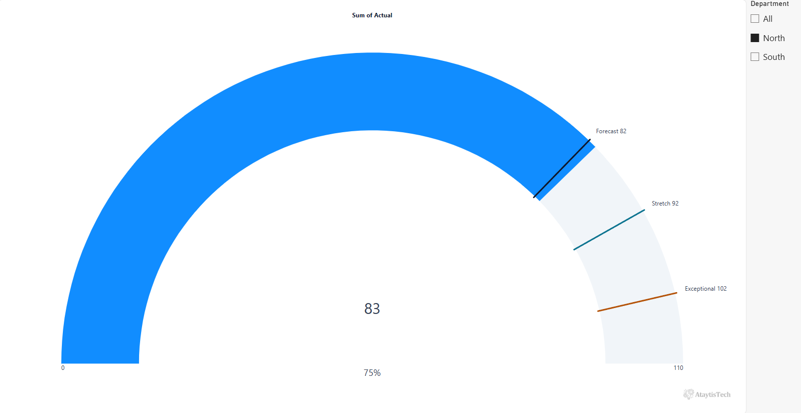
A small table with one row per department: an actual, a scale from 0 to 110, and three targets (Forecast, Stretch and Exceptional). For North the actual is 83 and the targets are 82, 92 and 102. A Department slicer sits beside the gauge. Tested in Power BI Desktop in September 2026.
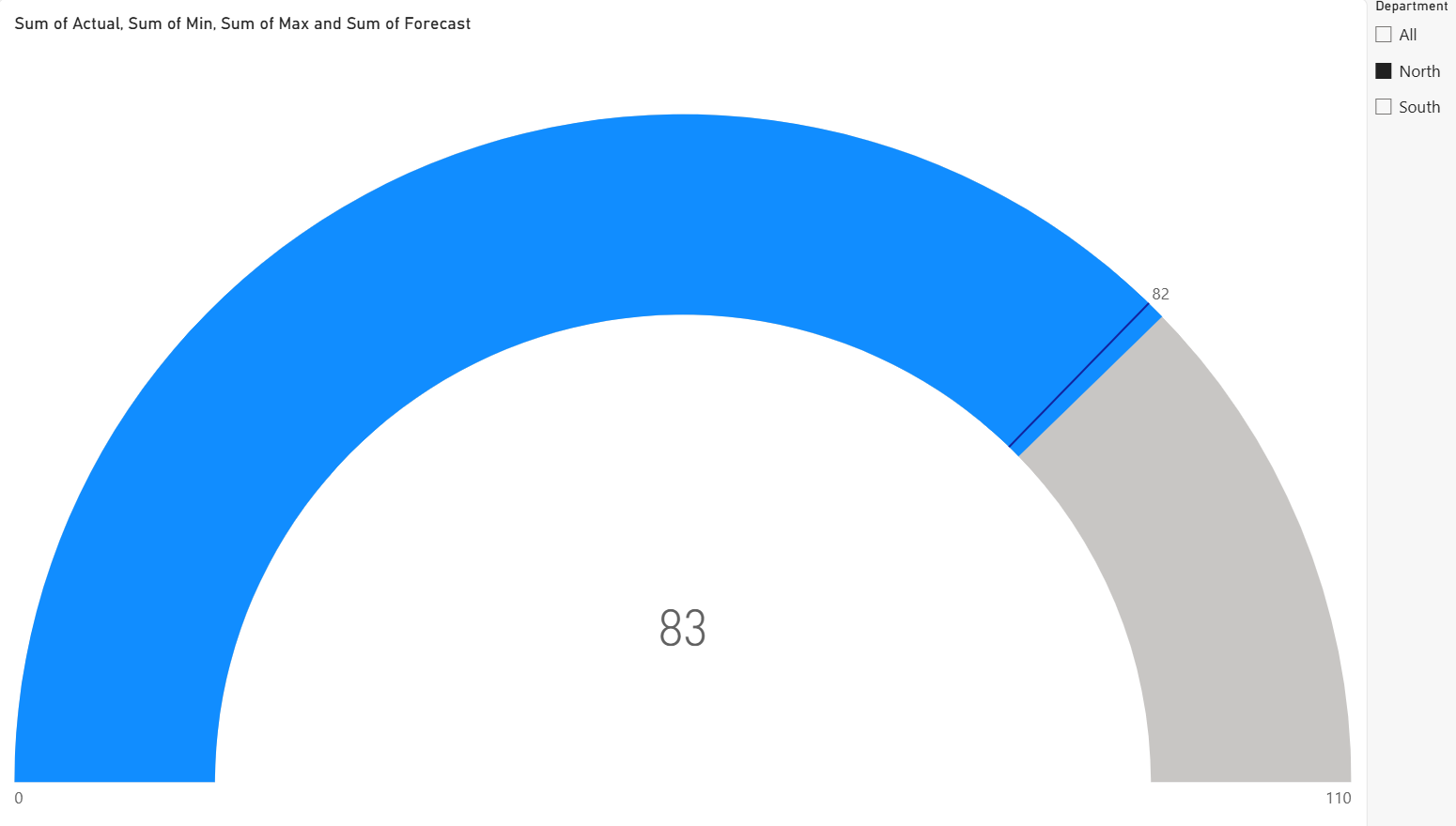
Three things we found:
- A second field replaces the first. Dragging Stretch onto Target value while Forecast was there swapped Forecast out. There is no Target 2.
- The typed target and the field target are either-or. With the well empty, you can type a target under Format visual → Gauge axis → Target. Put a field in the well and that box greys out. Microsoft's radial gauge documentation describes the same: remove the target field to make the manual setting available.
- Minimum and Maximum don't help. They move the ends of the arc. Using Maximum as a pretend second target leaves the dial looking full at the goal, which reads as “done” rather than “here is the next milestone”.
You are not alone in wanting this. A long-running Fabric Community thread asks for exactly the budget-plus-forecast gauge, and it keeps collecting replies.
Reproduce the test: sample CSV and setup
Download gauge-targets-sample.csv. North holds the values in our screenshots; South is invented so the slicer has something to switch to.
- Load it with Get data → Text/CSV and add a Gauge visual.
- Put Actual in Value, Min in Minimum value, Max in Maximum value and Forecast in Target value.
- Add a slicer on Department and select North.
- Now drag Stretch onto Target value and watch Forecast leave.
Which option fits your report
Start from what the reader needs to see, not from the visual you already have.
| You need | Use | What you give up |
|---|---|---|
| Actual against one goal | The native gauge | Nothing. It does this well. |
| Several targets, but one at a time is fine | Native gauge and a target selector | The other targets are hidden until picked. |
| Each comparison as its own tile | One native gauge per target | Canvas space, and no single shared scale. |
| All targets at once, dial not essential | Bar chart with constant lines | The dial. |
| A printed or exported gauge | Paginated report gauge | It is a separate report, not the interactive canvas. |
| All targets at once, on one interactive dial | Ataytis Motion | A licence to publish; free to build in Desktop. |
Workaround 1: let readers pick the target
If readers compare against one target at a time, you do not need more lines. You need a way to change which target the one line shows. Make a small table of target names, which is not related to anything else in the model, and put it on a slicer:
Target Choice = DATATABLE ( "Target", STRING, { { "Forecast" }, { "Stretch" }, { "Exceptional" } } )Then a measure that returns whichever target is selected, falling back to Forecast when nothing is:
Selected Target =
SWITCH (
    SELECTEDVALUE ( 'Target Choice'[Target], "Forecast" ),
    "Forecast", SUM ( Targets[Forecast] ),
    "Stretch", SUM ( Targets[Stretch] ),
    "Exceptional", SUM ( Targets[Exceptional] )
)
Put Selected Target in Target value and set the slicer to single select. It is native, it follows every other filter, and it is honest about showing one comparison at a time. The catch is in the name: nobody sees Stretch while Forecast is picked.
Workaround 2: one gauge per target
Three gauges side by side, Actual against Forecast, against Stretch and against Exceptional. It is the most reliable native option and anyone can maintain it. Give all three the same Minimum and Maximum, or the arcs will fill differently for the same actual and mislead.
It does take three times the space, and the reader has to hold three dials in their head to see that 83 has passed the forecast but is ten short of stretch. One dial with three marks says that at a glance.
Workaround 3: layering two gauges
The answer usually given in the community thread above is to stack two gauges with the same scale: the second shows only the second target, is made about 80% of the size, and is placed inside the first so its line appears on the inner arc.
We tried it. It can be made to look right for a screenshot, but we would not ship it:
- Turning off the background does not reduce a gauge to a clean, target-only layer. Its own arc and value still draw over the gauge underneath.
- The alignment is by eye, and any resize of the page or the visual breaks it.
- Tooltips and clicks go to whichever gauge is on top.
- Every extra target is another layer to line up and keep lined up.
For two targets on a report you will never resize, it might do. Beyond that it becomes a maintenance job.
Workaround 4: a bar chart with target lines
This is the one we would reach for first if the dial is not essential. A bar or column chart can carry several constant lines from the Analytics pane, and Microsoft's Analytics pane documentation confirms each line can have its own name, colour and style.
- Add a clustered bar chart with Actual in the value axis and set the axis range to your Min and Max.
- In the Analytics pane, open X-axis constant line (for a bar chart) and select + Add once per target.
- Name each line, give it a colour, and turn on its data label.
- For targets that change with slicers, select fx beside the line's value and choose the target measure.
You end up with a bullet chart in all but name: one bar, three labelled lines, native and fast. What you lose is the dial, and on a KPI page built around dials, a single bar can look out of place.
Paginated reports: a gauge with several pointers
Power BI Report Builder has a different gauge. It can hold several pointers on the same scale, one per field, as well as coloured ranges. See Microsoft's guide to formatting pointers on a gauge.
That is genuine multi-target support, but it lives in a paginated report, built in a separate tool for printing, PDFs and exports. It will not sit on the interactive page next to your other visuals.
When you need every target on one dial
Every native option above gives something up: the other targets are hidden, the space triples, the overlay breaks when resized, the dial becomes a bar, or the gauge moves to a separate report. If the question is “where are we against budget, forecast and stretch?” and the answer has to sit on one interactive dial, following your slicers, that is the gap a custom visual fills.
We built one for exactly this. It is worth being precise about what to look for: several target markers on one scale, each labelled, each from its own field or value. A second actual or a set of coloured bands answers a different question.
Ataytis Motion: up to four goals on one dial
Ataytis Motion is our Microsoft-certified Power BI visual. Its gauge takes up to four goals at once, each from a field or a typed number, and each drawn and labelled its own way. With a single goal it behaves like the native gauge:
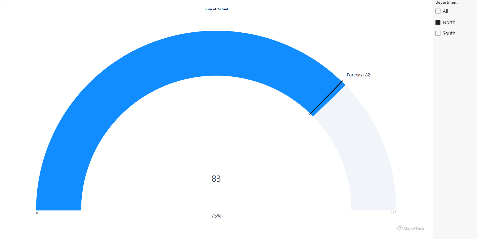
Add the other two and all three sit on the same arc:
Setting it up
- Put Actual in Measure, and Min and Max in Minimum and Maximum. A standalone gauge needs no Category.
- Drag your target fields into the Gauge goals well.
- Open the editor, go to the Chart tab, and under Goals select Add goal for each one.
- For each goal, set Value from to its field, or to Fixed value and type a number. Fixed values suit targets that are business rules rather than data, such as an SLA of 95% or bonus levels at 70, 80 and 90.
- Give each goal a Name, a Colour and a Marker: a line across the arc, a pointer outside it, or a band shaded from that point on. Label shows picks the name, the value or both.
Two details go beyond drawing the lines. The dial's own colour can switch at a goal instead of at a fixed percentage: the warning colour from Forecast, say, and the good colour from Stretch, which stays right when the targets move. And although Motion is known for animated charts, none of this needs an animation: with no Axis field it is a normal, static gauge. The gauge documentation covers the remaining settings.
As with any custom visual, check it works in your tenant and on your real data. It runs in full in Power BI Desktop with a watermark until licensed; publishing it for others needs a Microsoft Marketplace licence, per user, with a 30-day free trial.
Pitfalls that catch out any gauge
- Summed scales. Min and Max are summed by default. Select both departments and a 0–110 scale becomes 0–220, so the dial looks half empty. Change the aggregation to Minimum and Maximum in the field well, or use measures that return the scale you mean.
- No maximum set. Without one, the native gauge ends at double the current value, so the actual always sits at the halfway point. Microsoft's documentation describes this default.
- A target beyond the scale. If Exceptional is 120 and the scale ends at 110, the marker cannot sit inside the arc. Set the maximum above your highest target, not just above the actual.
- Unlabelled markers. Three lines of similar colour are guesswork. Label each one and pick colours that stay distinct for colour-blind readers.
- Too many targets. Past three or four marks a dial gets cluttered. If you have more, a table or a bar with target lines will read better.