Choosing a chart type
What each of the eleven charts is for, how switching between them behaves, and which questions each one answers.
Four families
The chart types group into four families by the question they answer. Picking the family first narrows the choice to two or three.
| Family | Charts | The question |
|---|---|---|
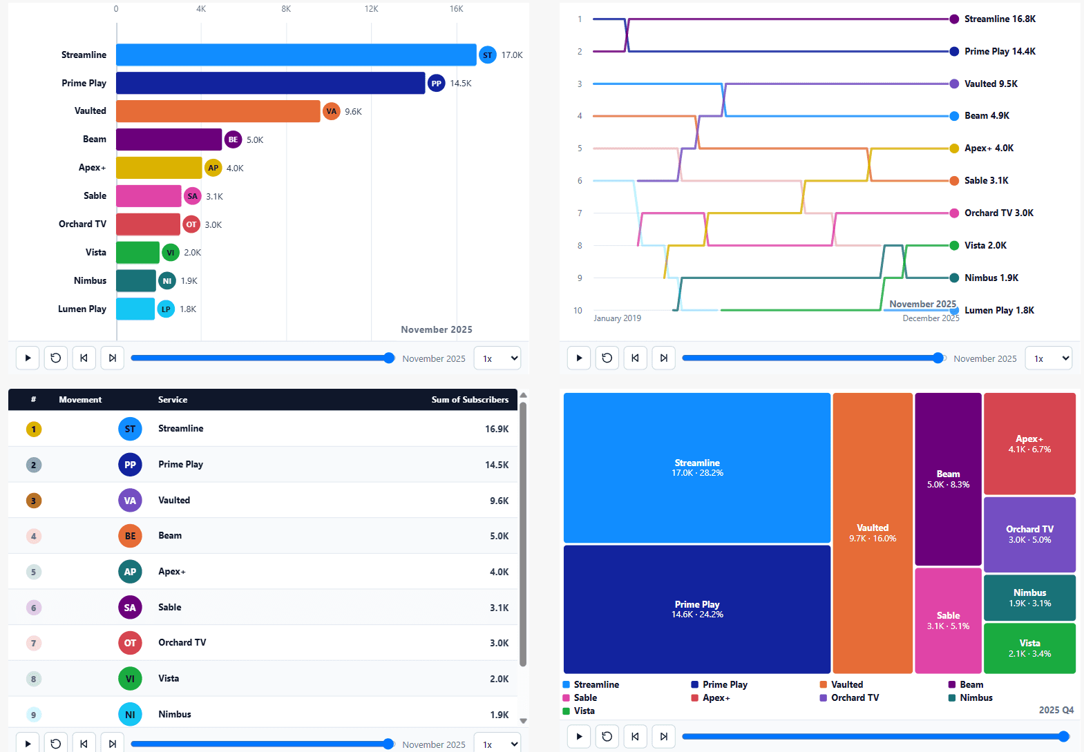
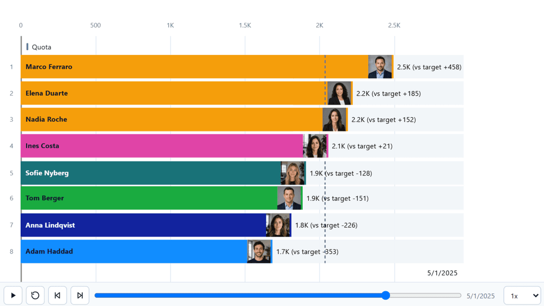
| Ranking | Bar race, Lollipop race, Leaderboard, Bump race | Who is ahead, and how has that changed? |
| History | Line / area, Line and column | What has the shape of this measure been over time? |
| Composition | Donut and pie, Funnel, Treemap, Waterfall | How does the whole divide, and what makes it up? |
| Single value | Gauge | Where are we against a target right now? |
Magnitude or position
Within ranking, the important split is whether the reader should see how far ahead somebody is, or only that they are ahead. A bar race encodes magnitude: the bar lengths say a leader is twice the size of the runner-up. A bump race encodes position only: rank one is rank one, whether it was won by a mile or by a point.
A leaderboard is the same ranking as a table, with movement indicators instead of a plotted scale, which suits a set of competitors whose names and several measures matter more than their relative size.