Ataytis Motion
Colour, scales and axes
How categories are coloured, and how the value axis is bounded as the numbers change underneath it.
Colour
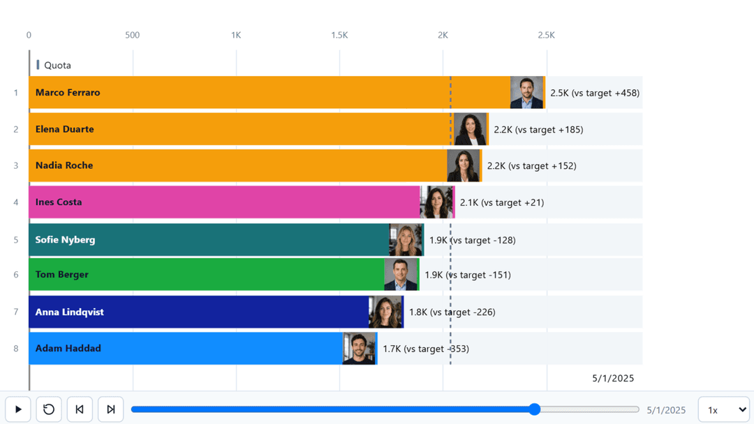
Seven palette modes, with individual categories overridable on top of any of them. Power BI's own conditional formatting on data colours is supported.
| Mode | How colour is assigned |
|---|---|
| Theme | From the report theme. |
| Categorical | A distinct colour per category. |
| Single colour | One colour for everything. |
| By rank | By the category's current position. |
| Gradient | Across the value range. |
| Positive / negative | By the sign of the value. |
| Target status | By standing against the target. |
How the value axis is bounded
An animated chart has a problem a static one does not: the numbers change underneath the axis. Scale mode decides how that is handled.
| Mode | Behaviour |
|---|---|
| Dynamic | Grows with the data drawn so far. |
| Global | Fixed across the whole run. |
| Fixed | Bounds you type in. |
| Field | Bounds from the Minimum and Maximum wells. |
Logarithmic scale
The value axis can be linear or logarithmic. A log axis uses decade ticks and is available on bar race, lollipop, line / area and line and column, which is where a spread of several hundred times between the largest and smallest series actually happens.
Axis layout
- The axis can sit at the start, at the end, or on both sides.
- Zoom sliders are available on either axis.
- Timeline labels run along the category axis, with density control.
- Gridlines and tick spacing are set independently.