Ranking charts
Bar race, lollipop race, leaderboard and bump race — the four ways of showing who is ahead.
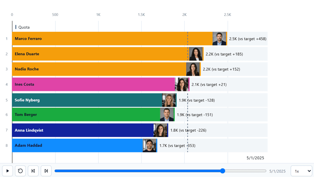
Bar race and lollipop race
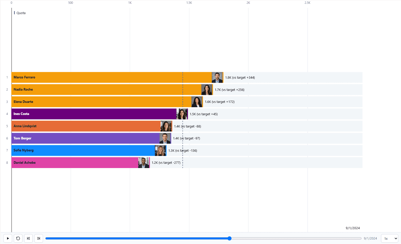
Ranked marks that resize and reorder as the axis advances. The lollipop is the same chart drawn as a marker with an optional stem, which is lighter on the eye when there are many categories or when the bars would otherwise dominate the canvas.
Both accept images on the marks, error bars from the Minimum and Maximum wells, and a target overlay from the Target / Comparison well.
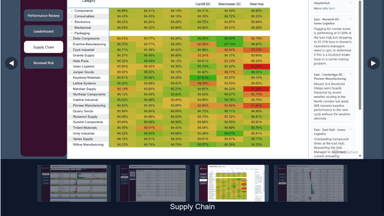
Leaderboard
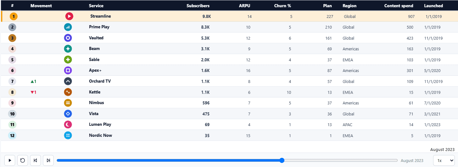
Ranked rows that read as a table rather than a plot. A rank badge and movement arrows replace the bar, and up to sixteen extra measures can be shown as columns from the Leaderboard columns well.
| Setting | What it does |
|---|---|
| Row style | Clean, cards, or tinted, with optional alternating rows. |
| Column order | The order the extra measures appear in. |
| Value position | Where the primary measure sits relative to the name. |
| Movement | Arrows showing the change in rank since the previous frame. |
Bump race
Rank over time as crossing lines. Each competitor is a line moving between rank positions, so the chart answers who has been climbing rather than who is biggest.