

Format pane
Hierarchy
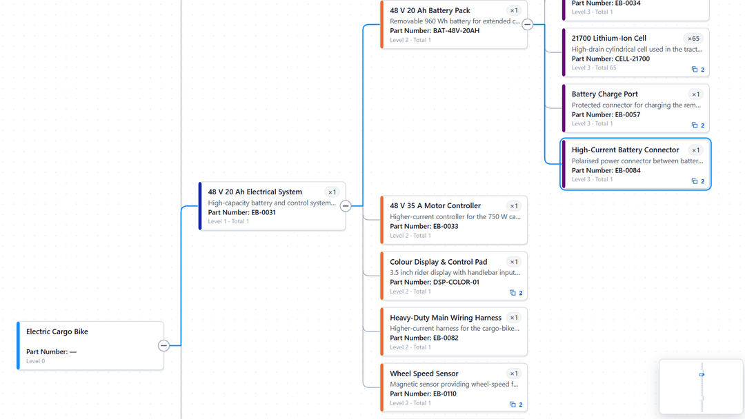
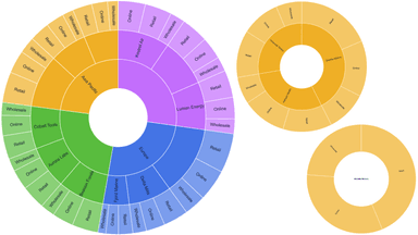
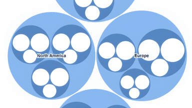
Set expansion defaults, indentation, child counts, expansion symbols, and per-level styling across twelve hierarchy levels.
Expansion and indentation
| Setting | What it does |
|---|---|
| Default expand rows | Whether the matrix opens with rows expanded rather than collapsed to the top level. |
| Expand to level | How far down the hierarchy that automatic expansion goes. |
| Indent width | The horizontal step applied to each level in a compact layout. |
| Row padding | Vertical space inside each row. The single most effective control for making a dense matrix comfortable. |
| Show child count | Appends the number of children to a parent row, so readers know what is hidden before expanding. |
| Level 1 – Level 12 | Per-level switches for the settings above where a level-by-level choice makes sense. |
Per-level styling
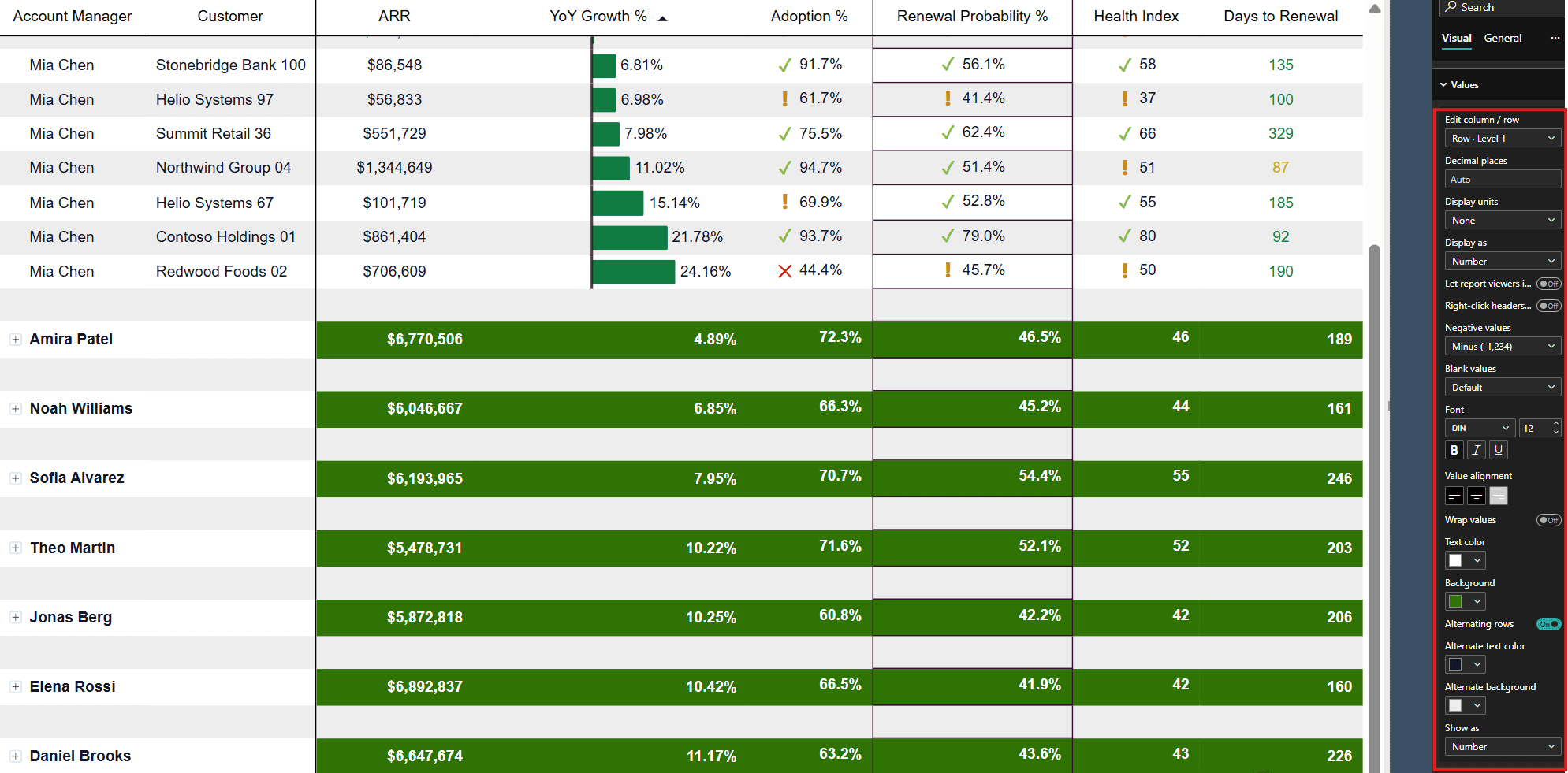
The Hierarchy styling group applies formatting to one hierarchy level at a time. Choose the level with Edit level, then set its font, weight, extra padding, and extra indent. Overrides are stored per level, so a level-one section header can be bold and spaced while level three stays plain.