Format pane
Headers
Rename, resize, reorder, wrap, and pin column and row headers, with per-header style overrides.
Column headers
| Setting | What it does |
|---|---|
| Edit header | Selects which header the settings below apply to, so each one can differ. |
| Rename header | Shows a different label without renaming the underlying field. The new name is what exports, too. |
| Column width (px) | Fixes a width rather than letting it size automatically. |
| Sort columns | The sort applied to the column axis: None, A-Z, Z-A, Smallest to largest, Largest to smallest, Calendar ascending, Calendar descending, or Custom order. |
| Custom column order | With Sort columns set to Custom order, this holds your explicit sequence — so columns can appear in whatever order the report needs, regardless of alphabet or underlying data order. |
| Sticky column headers | Keeps headers visible while the reader scrolls down. |
| Wrap column headers | Allows a long header to run onto a second line instead of being truncated. |
| Header background, text color, font, alignment | Standard appearance controls, applied per header when a specific header is selected. |
| Horizontal padding and Vertical padding | Space inside the header cell. |
| Allow manual resize | Lets report readers drag column edges themselves. |
Row headers
| Setting | What it does |
|---|---|
| Sticky first row header | Pins the first row-header column so it stays visible while scrolling horizontally. Essential once a matrix is wider than the screen. |
| Wrap row headers | Allows long row labels to wrap rather than truncate. |
| Row alignment | Horizontal alignment of the row header text. |
Expansion icons
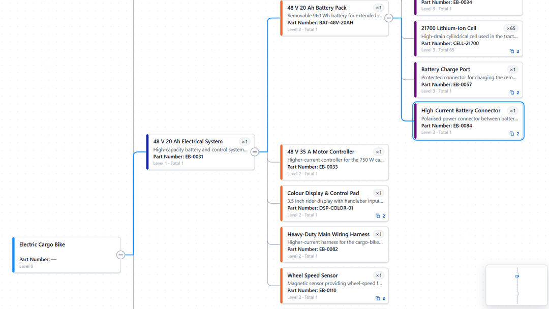
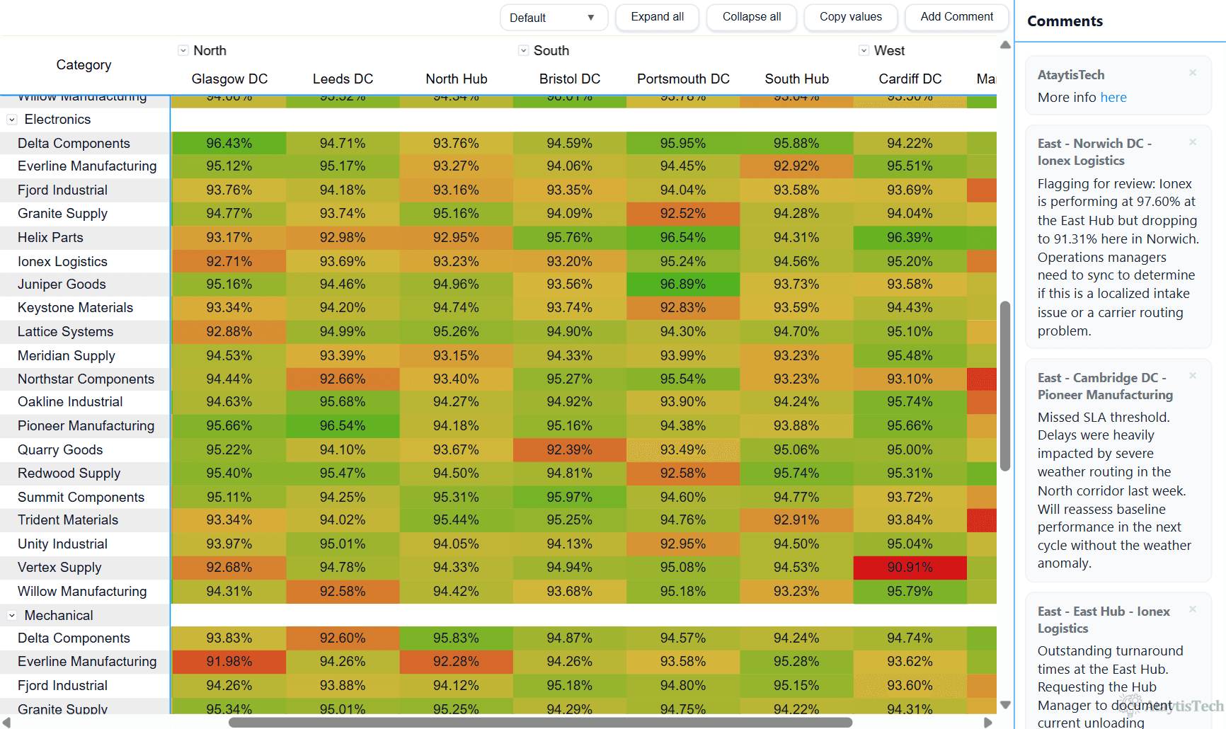
The control readers click to expand a hierarchy is configured here, with separate groups for row headers and column headers so the two can differ.
| Setting | What it does |
|---|---|
| Show expansion arrows | Whether the control appears: Off, All levels, Top level only, or specific levels chosen individually from level 1 to level 12. |
| Expansion icon | Which shape is used — Chevron, Plus / minus, Caret, Triangle, Circle, Diamond, Square, or Arrow. This is a fixed set; custom images are not used here. |
| Fill style | Stateful, where the icon is outlined when collapsed and filled when expanded, or forced to Outline only or Filled only. |
| Icon size | Rendered size, from 1 to 24. |
| Show icon box, Box color, Icon color | An optional container behind the icon, which helps it read as something clickable, plus the colours for both. |