Details panel and appearance
The Details panel and Appearance tabs of the Ataytis BOM editor: the panel's position, width and sections, theme, font, density, colours, level colours and quantity decimals.
Details panel
| Setting | Options | Default |
|---|---|---|
| Show details panel | On or off | On |
| Open on click | Selecting a position opens the panel. | On |
| Position | Right, Left | Right |
| Width | 260 to 560 px | 340 px |
| Section setting | Shows | Default |
|---|---|---|
| Actions | Highlight all, Where used, Focus, Filter report, Expand all, Collapse. | On |
| This position | Parent, quantity per, extended quantity and level. | On |
| Item summary | Occurrences, parents, components and levels below. | On |
| Detail fields | Your Details and Tooltips columns. | On |
| Related items | Components, Used in and Top-level products. | On |
Theme and text
| Setting | Options | Default |
|---|---|---|
| Theme | Report, Light, Dark. Report follows the report's background. | Report |
| Font | Segoe UI, Segoe UI Semibold, Arial, Calibri, Tahoma, Trebuchet MS, Verdana, Georgia, Consolas | Segoe UI |
| Text size | 9 to 18 px | 12 px |
| Corner radius | 0 to 24 px | 6 px |
Density
| Preset | Text size | Card width | Table row height |
|---|---|---|---|
| Compact | 11 px | 196 px | 24 px |
| Comfortable | 12 px | 232 px | 30 px |
| Spacious | 13 px | 272 px | 36 px |
A preset also sets the space between cards and levels, the indent and the header height. It applies once; anything changed afterwards stays.
Colours
Background, Cards and rows, Borders, Connectors and Text follow the theme until you set them. Selection is #118DFF and Highlight is #F79009 by default. Reset appearance restores them all.
Level colours
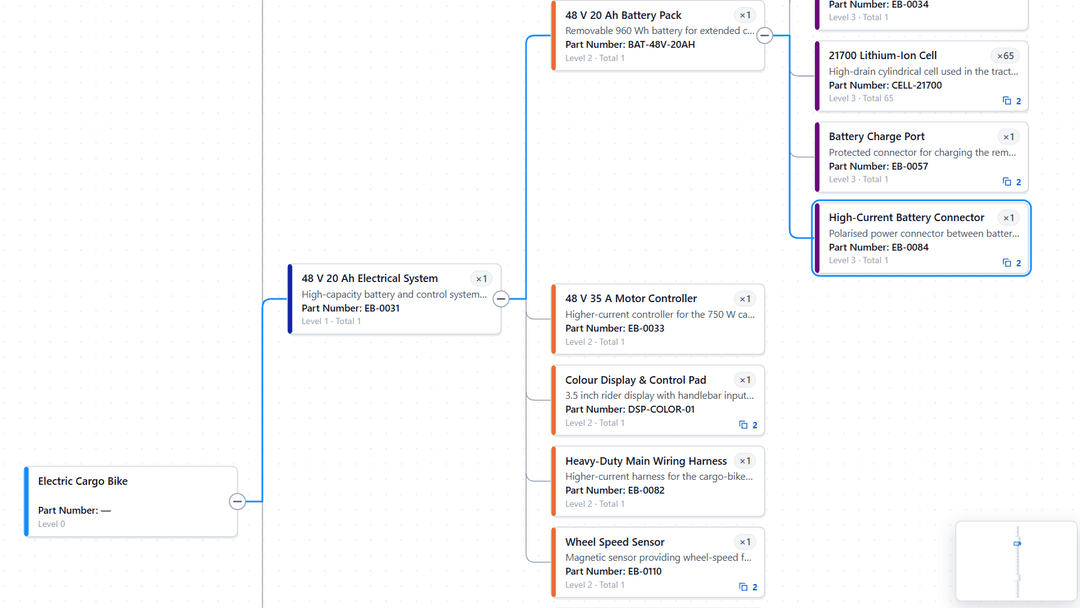
A colour for the top level and for levels 1 to 5, used by Tree → Colour by level and Table → Shade by level. A blank level takes a colour from the theme.
Numbers
Quantity decimals is As in the model, which uses the Quantity column's own format, or a fixed 0 to 4 decimal places.