


Can Power BI Matrix show more than 100 columns?
The native Matrix has a hard limit of 100 visible columns. Microsoft documents this for both Power BI Desktop and the service. Extra columns are not displayed; totals and subtotals are part of the limitation. There is no documented setting to increase it. Microsoft: Matrix limitations.
Making columns narrower or scrolling farther does not remove that ceiling. To work around it, you need to show fewer column groups at a time, change the layout, use a paginated report, or use a custom Matrix that supports more columns.
What happened when we tested 101 columns
We used a simple sequence: Period 001 through Period 101, each with a nonblank amount. Both visuals used ColumnLabel in Columns and Sum of Amount in Values, with Rows empty. The final record was Period 101 with an amount of 1,101.
In the native Matrix, the last column header was Period 100. Power BI displayed the warning “Too many values. Not showing all data.” In Ataytis Matrix, Period 101 appeared with its value of 1,101.
Native Matrix: stops at Period 100
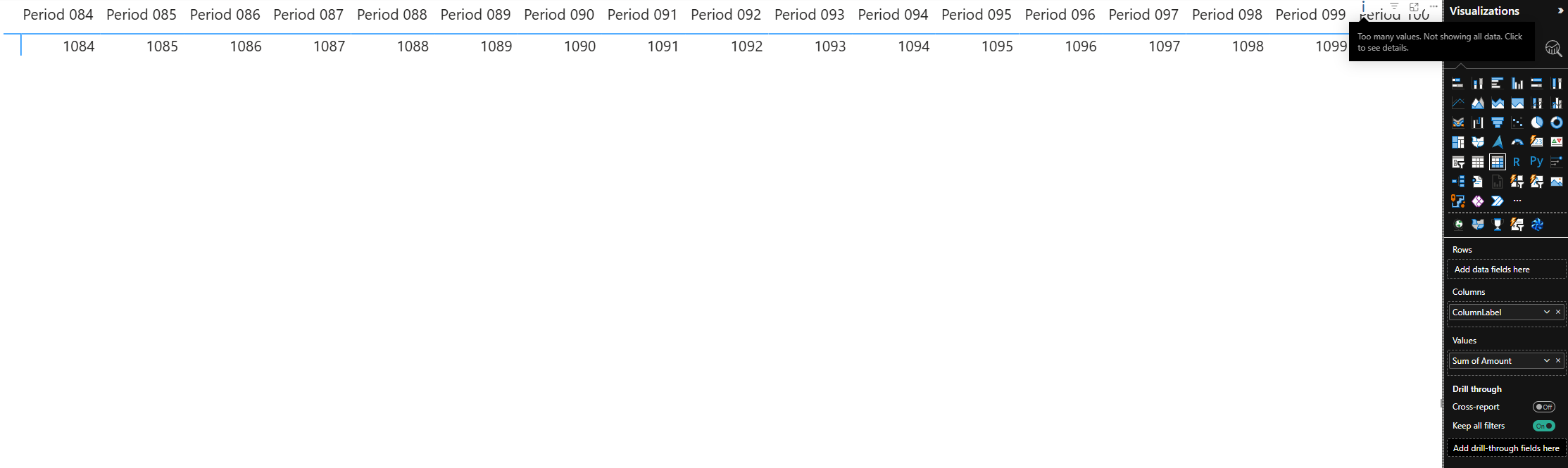
Ataytis Matrix: Period 101 is displayed
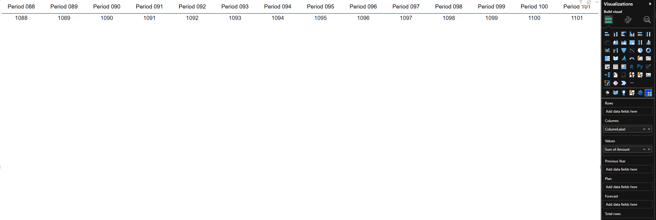
Reproduce the test: CSV and setup
Download the 101-column test CSV. It contains invented data so no business information is needed.
- Import through Get data → Text/CSV. Keep ColumnLabel as text; ColumnNumber and Amount as whole numbers.
- Sort ColumnLabel by ColumnNumber. Add ColumnLabel to Columns and Sum of Amount to Values. Leave Rows empty, use no hierarchy, and turn totals and subtotals off.
- Sort labels ascending, include all 101 labels, and scroll to the right edge. Compare the final label and any warning in each visual.
- As a separate check, filter ColumnNumber to 101 alone. Its amount is 1,101. This distinguishes an unavailable member from one omitted in the wide view.
For a boundary check, also try ColumnNumber ≤ 99, ≤ 100 and ≤ 101. Record your Desktop version, storage mode and total settings; different hierarchies and measure layouts need their own checks.
Why scrolling does not reveal the missing columns
Microsoft's data-reduction documentation explains the difference: Matrix rows load in windows of 500, while columns use Top 100 grouping columns. Vertical scrolling can fetch another row window; horizontal scrolling is not a way to fetch columns 101–200.
Also, one field is not one displayed column. A Date field can create 365 daily column groups. The single ColumnLabel field in our test creates 101.
One field, 101 column groups
| ColumnLabel | Amount |
|---|---|
| Period 001 | 1,001 |
| Period 002 | 1,002 |
| … | … |
| Period 101 | 1,101 |
Columns: ColumnLabel
The native Matrix does not display the final group in our test.
Microsoft says multiple Values do not count against the grouping-column reduction. That is why “dates × measures” is not a reliable formula for the exact cut-off in every layout. Check the expanded hierarchy and totals you actually intend to publish.
When a wide Matrix is worth keeping
A wide grid is usually a poor starting point for a dashboard. It pushes comparisons off-screen, hides patterns in horizontal scrolling, and asks the visual to load and format more cells. If the question is “how did the year go?”, a trend chart or 12 monthly totals is often clearer than 365 daily columns.
But a summary does not answer every question. There are legitimate reasons to keep the detail:
- Daily balances or operational history. A reviewer needs an uninterrupted sequence of exact daily values, not just monthly totals.
- Countries, markets or business units. A standard comparison schedule may require more than 100 entities in a fixed horizontal order.
- Planning and financial schedules. Periods, scenarios and versions need to remain together for reconciliation.
This is also what users are asking for. The community request to increase the 100-column limit cites financial statements and sales analysis. A banking commenter asks for 500 or 1,000 columns to show two years of daily history. These are requests, not an announced Microsoft change.
The useful question is whether selecting another month would interrupt the comparison. If it would, “just add a slicer” does not fully solve the requirement.
Choose a workaround with this decision tree
Which approach should you use?
Start at the top. Follow Yes or No at each question.
Does the full view fit the native limit and remain readable?
YesUse the native MatrixCheck the expanded layout, totals and interaction speed.NoNext questionMust users keep all the columns together in one view?
NoShow a selection at a timeUse a period slicer, field parameters or drillthrough.YesNext questionIs the main requirement a document or an export?
YesUse a paginated reportDesign for the target PDF or Excel output.NoNext questionWould weekly or monthly summaries answer the question?
YesGroup the dates; keep detail on demandSummarise the year, then drill through to daily values.NoEvaluate a custom Matrix
Power BI Matrix workarounds: pros and cons
| Approach | Advantage | Trade-off |
|---|---|---|
| Period slicer / column pages | Keeps exact daily values in the native Matrix. | Only the selected period is available; totals follow the filter. |
| Field parameters | Readers choose the dimensions or measures they need. | Selecting too much can still exceed the limit. |
| Monthly summary + drillthrough | Shows the whole year in fewer columns. | Daily detail requires another view. |
| Move a dimension or values to rows | Keeps the data in one native Matrix. | Changes the reading direction and makes the report taller. |
| Paginated report | Designed for complete documents and exports. | Separate authoring; output formats need layout checks. |
| Custom Matrix | Can retain a wider interactive grid. | Product-specific limits, licensing and tenant requirements. |
1. Use a slicer when one period at a time is enough
Keep Date in Columns and add a month slicer. Selecting January requests 31 daily columns instead of the whole year. Use a year-month label, not just a month name, so January from several years does not get combined accidentally.
For non-calendar columns, assign members to numbered groups and use a single-select page slicer. Leave room for any totals. Check the cleared-selection behaviour: removing the filter can bring the full column set back. Label totals as selected-period totals if that is what they show.
2. Use field parameters for a choice of fields
Field parameters are useful when readers do not need every dimension or KPI together. Choose Modeling → New parameter → Fields, select the fields, and add the parameter's slicer.
Put a dimension parameter in Columns to switch between Month and Date, or a parameter of explicit measures in Values to choose KPIs. A Date selection still needs a restricted period if it produces more than 100 groups. Microsoft also notes that clearing the parameter selection behaves like selecting all fields—not none.
3. Summarise the year, with daily detail on demand
Moving from Date to Month on the column axis keeps the full year but changes the level of detail. That is different from a month slicer, which keeps daily detail and removes other months.
A monthly summary and a month slicer do different jobs
Full year, daily
365columns
Every day stays separate. Too wide for the native Matrix.
| 01 Jan | 02 Jan | … | 31 Dec |
|---|---|---|---|
| 1,003 | 1,006 | … | 2,095 |
Full year, monthly
12columns
Keep the whole year. Add the daily values into monthly totals.
| Jan | Feb | … | Dec |
|---|---|---|---|
| 32,488 | 31,822 | … | 63,550 |
January, daily
31columns
Keep daily detail. Filter out the other months.
| 01 Jan | 02 Jan | … | 31 Jan |
|---|---|---|---|
| 1,003 | 1,006 | … | 1,093 |
Add a drillthrough page for daily values when a monthly total needs investigating. Use the underlying month and entity fields as drillthrough filters.
Try these three layouts with the yearly CSV
Download matrix-year-2026.csv. It has three neutral sample series and 365 dates. Put Series in Rows and Sum of Amount in Values. Use the plain Date field—not Date hierarchy—for daily columns, or MonthLabel for monthly columns. For January only, keep Date in Columns and filter MonthLabel to 2026-01. Turn totals off to match the illustration.
4. Move the wide dimension or the measures to rows
If entities create too many columns, put them in Rows instead and let readers scroll vertically. This can keep the complete list available without a custom visual, provided the new orientation still supports the comparison.
If measures make each period too wide, try Values → Options → Switch values to rows. This moves the measures; it does not fix a column axis that still contains 365 dates.
5. Use paginated reports for a document or export
A paginated report uses a different rendering model from the native Matrix and can produce wider tabular output. It is worth considering for a complete schedule that will be printed, distributed or opened in Excel. It is a separate report to author and test, not a setting on the existing visual.
One correction to a common claim: 256 columns is the legacy .xls export limit, not the current Excel limit. Microsoft's .xlsx renderer supports 16,384 columns per worksheet. Report alignment, page breaks and merged cells still need checking. Excel renderer limits.
When you need the wide grid: Ataytis Matrix
Ataytis Matrix is our Microsoft-certified custom visual. It supports 1,000-column layouts, with virtualised rendering in performance mode, sticky row headers and configurable cell loading. It addresses the case the native workarounds cannot preserve: keeping the full set of columns in one interactive Matrix.
The screenshot above shows it displaying the 101st period that the native Matrix omits. For a full-year daily report, the same principle lets you keep the date sequence together rather than divide it into month selections.
More available columns do not make every large report fast. Test your real measures, row counts and published report, and check the performance and loading settings. Desktop evaluation includes a watermark; published use requires the appropriate Marketplace licences and tenant permission.
Missing columns below the limit? Check these first
The 100-column ceiling is not the cause of every missing member. Check slicers and visual/page/report filters, interactions from other visuals, and whether the column hierarchy is expanded to the intended level. Then filter to the missing member on its own.
A blank measure can cause a member to disappear. Show items with no data can include otherwise omitted members in supported cases, but it does not increase the column limit. Check relationships and measure logic if the value is still missing on its own.
Does DirectQuery allow 125 Matrix columns?
Microsoft documents a separate 125-column limit for table or Matrix results returning more than 500 rows from DirectQuery sources. That condition is not an upgrade to the native Matrix's 100 grouping columns. Switching storage mode is not a workaround for this test. DirectQuery limitations.
For long row lists, see our Power BI Matrix search bar guide: it compares slicer search, typed-text filtering and an integrated Matrix search.
Once your periods are visible, you may want to rank products by one of them. Our guide to sorting Matrix rows by an individual column compares the native measure workaround with direct month-header sorting.