A screen is not a report
Most Power BI reports are built to be opened, explored, and closed. Someone sits down, pulls up a tab, filters by region or date, reads a number, and moves on. The report is a tool for answering questions.
A dashboard on a TV or office screen works completely differently. Nobody sits in front of it. Nobody clicks anything. It runs all day in a corridor, a reception area, a factory floor, or a meeting room wall — and people glance at it in passing. The dashboard isn't answering questions. It's broadcasting information.
The mistake most people make when building for a screen is treating it like a regular report. The same layout, the same font sizes, the same default charts — just displayed on a bigger monitor. The result is a dashboard that's either unreadable from a normal viewing distance or so dense with information that nobody processes any of it.
Designing for a screen means rethinking almost every assumption you bring from standard report building.
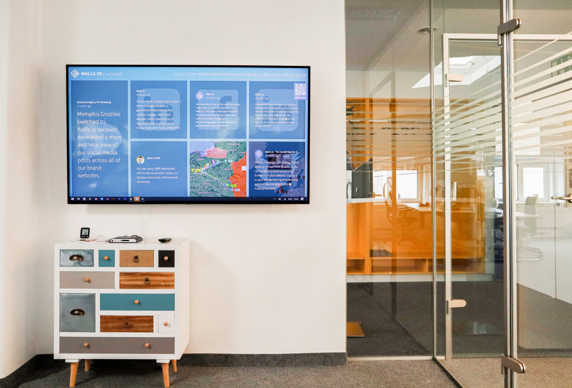
Display screen dashboards are watched, not browsed — the design requirements are entirely different
Layout and canvas size
The first practical decision is canvas size. Power BI's default canvas is 1280×720, which maps to 16:9 and fills most modern screens cleanly in full-screen mode. If your TV is 1920×1080 or 4K, the report will scale up — but it's worth checking how it looks at your actual display resolution before you commit to a layout.
Unlike a browser report, a screen display has no scroll. Everything that needs to be visible must fit on a single page at once. This is a hard constraint and it forces a different kind of content curation — you can't include everything and trust that viewers will scroll down to find what matters.
Think in zones rather than grids. A typical screen layout has a clear hierarchy: one or two hero numbers that read from across the room, a secondary tier of supporting metrics, and peripheral elements like a clock, a status indicator, or ambient visuals in the margins. Each zone has a distinct size and visual weight.
Hero zone
The one or two numbers that matter most — large enough to read from 5+ metres
Secondary zone
Supporting metrics, charts, and trend indicators — readable from normal office distance
Peripheral zone
Time, status, branding, ambient visuals — context rather than content
Legibility at distance
The single biggest failure mode in screen dashboards is text that is too small to read from a normal viewing distance. What looks perfectly legible on a laptop monitor at arm's length becomes unreadable on a 55-inch TV five metres away.
A rough rule: anything a viewer needs to read from across a room should be at least 36–48pt. Hero KPI numbers should be 60–80pt or larger. Axis labels and secondary text that only matter up close can be smaller, but if they're not readable at distance, ask whether they need to be on the screen at all.
Hero KPI values
Must be legible from the far side of the room
Section headings
Readable at medium distance — 3–5 metres
Chart data labels
Readable at normal standing distance
Supporting text
Only include if viewers will stand close enough to read it
Bar charts and line charts with many data points are often the wrong choice for screens. From a distance, the individual values become unreadable and the chart collapses into a shape. Large single-number KPI cards, bold status indicators, and simple trend lines with only a few data points read far more clearly.
Why dark themes work better on screens
A white background on a TV screen in a dim office or corridor looks like a lightbox — harsh, glaring, and uncomfortable to look at for extended periods. It also makes the screen itself the most prominent thing in the room rather than the data on it.
Dark backgrounds absorb ambient light rather than competing with it. Colours appear more saturated and vivid against a dark canvas, which means metrics and status indicators pop without needing to be oversized. The overall effect is a display that looks intentional and finished rather than a browser tab projected onto a wall.
OLED and modern LED screens specifically render dark backgrounds well — deep blacks with no bleed. Even on older LCD screens, a very dark navy or charcoal is significantly easier to sustain visually than white.
The practical tradeoff is that building on a dark canvas requires more effort upfront — you need to set visual backgrounds to transparent, recolour axis text, and reconsider default chart colours that were designed for white. But the result is almost always worth it for screen contexts.
Designing for passive viewing
Standard Power BI reports are built around interaction: slicers, drilldowns, cross-filtering, tooltips. On a screen that nobody touches, all of that disappears — and anything in your layout that assumes interaction becomes dead weight.
Remove or rethink
Design in its place
This constraint is actually clarifying. When you remove every interactive element, you are forced to decide which information is important enough to always be visible. Most screen dashboards end up more focused and more readable than the analytical reports they were built alongside.
Making the screen feel live
A screen that never moves blends into the background within a few days. People stop registering it. The data might be refreshing, but if the visual appearance doesn't change, the screen looks frozen — and frozen screens get ignored.
The solution is ambient motion: visual elements that move continuously but don't demand attention. The movement signals that the screen is live and current without interrupting whatever else is happening in the room.
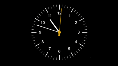
An analogue or digital clock in the corner gives the screen a heartbeat — it is visually live even when the data hasn't changed. Particularly useful for operations and logistics contexts.
A particle network or background animation in a peripheral zone adds continuous motion that reads as "this is a live system" without competing with the data.
Cycling text
Rotating through phrases — department announcements, key metrics, targets — keeps the screen visually fresh and adds information value beyond static numbers.
Status indicators
Colour-coded RAG indicators that change with the data are their own form of motion — the screen visibly reacts to real-world events.
Cycling text in particular is a common requirement for screens in shared spaces — a reception area that wants to rotate through a welcome message, the company tagline, and a key operational metric, or a team dashboard that surfaces different targets depending on the time of day.
In Power BI, native text visuals are static — a text box shows exactly one thing and never changes. Getting text to animate or cycle requires going outside the standard visual library. Deneb, the free custom visual built on Vega, makes this possible through a spec-driven approach where text phrases, transition behaviour, and particle style are all configurable without writing code from scratch.

Animated particle text cycling through phrases — built with Deneb and Vega, no data source required
The Particle Text Visual is a ready-made Deneb spec that does exactly this. You set your phrases, choose colours and particle style, configure the transition timing, and copy the JSON into a Deneb visual. It cycles automatically, requires no data connection, and runs indefinitely — making it well suited to the peripheral zone of a screen dashboard where you want presence without distraction.
Keeping data current on an unattended screen
A screen dashboard that shows data from six hours ago is worse than no dashboard at all — it actively misleads anyone who reads it. Keeping data current on an unattended display requires thinking through the full refresh chain.
Power BI has two distinct refresh mechanisms relevant to screen setups:
Dataset refresh
How often Power BI pulls new data from your source. Configured in the Power BI Service under dataset settings. Can be scheduled as frequently as every 30 minutes on standard capacity, or near-real-time with DirectQuery or streaming datasets.
Page auto-refresh
How often the open report page re-queries the dataset. Set at the page level in Power BI Desktop under Page settings → Page refresh. Useful for screens where someone needs to see data update without touching anything.
For most screen use cases — operations boards, reception displays, team metrics — a dataset refresh every 15–30 minutes combined with a page auto-refresh at the same interval gives data that feels current without hammering your source system. Add a "last refreshed" timestamp card to the layout so viewers can see exactly how old the data is without guessing.
Getting it onto the screen
Once the report is built and published to Power BI Service, getting it onto a physical screen is usually straightforward — but the right approach depends on your setup.
Browser in full-screen mode
The simplest option. Open the report in Power BI Service on a browser connected to the display, press F11 for full-screen, and use Power BI's own full-screen view (the icon in the top-right of the report). Works on any device with a browser.
Windows PC or mini PC attached to the TV
A dedicated PC — even a low-cost mini PC or an old laptop — connected via HDMI runs the report in a browser continuously. Set the PC to not sleep, disable the screensaver, and open the report on startup.
Chromecast or smart TV browser
Cast a browser tab from a nearby laptop, or use the built-in browser on a smart TV. Works for low-frequency displays but not ideal for reports requiring auto-refresh or Pro-capacity features.
Power BI Embed (for kiosk or public display)
If the screen is in a public space or needs to run without a logged-in user, Power BI's Publish to Web creates an embeddable iframe — but be aware this makes the report publicly accessible with no authentication.
Add animated cycling text to your screen
Set your phrases, style, and transition timing on the product page — then copy the spec straight into Deneb.
One-time purchase · Instant access · Use in unlimited reports