
Why most Power BI dashboards look dated
Power BI's defaults are designed for compatibility, not aesthetics. The white background, the automatic colour palette, the gridlines on every chart, the bold title in the top-left of every visual — these are safe choices that work in any context. They don't offend anyone. They also don't impress anyone.
The result is that most Power BI reports look like they were built by the same person from the same template. Not because the builders lacked skill, but because nobody changed the defaults.
Modern dashboard design in other tools — Figma mockups, Tableau Public showcases, custom web apps — tends to share a few consistent properties: darker or muted backgrounds, tighter colour discipline, more whitespace, and intentional typography. None of those things are technically out of reach in Power BI. They just require actively overriding what the tool gives you by default.
Here's a practical breakdown of what actually makes a difference.
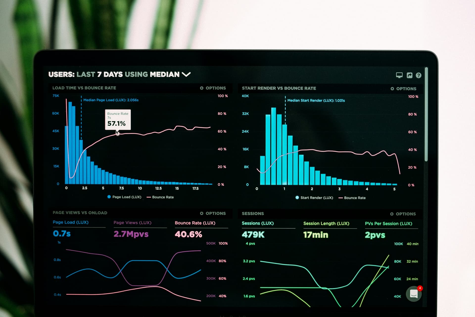
Dark backgrounds, tight colour palettes, and minimal clutter — the hallmarks of modern dashboard design
Rethink the white background
White is the default canvas colour in Power BI and it is the single biggest contributor to reports looking generic. Almost every polished dashboard you'll see in design portfolios or conference showcases uses something other than pure white — usually a very dark background, a muted off-white, or a soft neutral grey.
Dark backgrounds in particular have a strong effect on perceived quality. They make colours pop, they reduce the visual weight of borders and dividers, and they give reports a finished, intentional look that white backgrounds rarely achieve. They're especially well suited to operational and monitoring dashboards — the kind that run on screens in a control room or office floor — where the visual needs to read clearly from a distance.
If full dark mode feels too dramatic for your context, a very light grey (#F3F4F6 or similar) is often enough to lift a report out of the generic white look while still feeling corporate and neutral.
Dark
Strong contrast, professional, suits monitoring contexts
Mid-dark
Slightly softer dark — good for display boards
Light neutral
Subtly removes the clinical white feel
Remove visual clutter
Most default Power BI charts contain a lot of elements that exist for completeness rather than because they help anyone understand the data. Removing them is one of the highest-leverage things you can do.
Gridlines
Turn off major gridlines on most charts. Data labels or a clean axis are usually enough. If you need gridlines, make them very faint — 10–15% opacity rather than the default solid grey.
Chart borders and shadows
The border around each visual adds visual weight without adding meaning. Turn them off under Visual > Border. Drop shadows similarly — they add noise on dark backgrounds especially.
Legend placement
Legends positioned below a chart take up space and force the eye to travel. Where possible, label series directly on the chart or move the legend to the right side at a smaller size.
Default visual titles
Power BI generates titles automatically but they're often redundant — the chart content already shows what it is. Either remove the title, replace it with a shorter, more useful label, or use a text box positioned above the visual for more typographic control.
Axis titles
If the axis values are self-explanatory (months, years, product names), the axis title adds noise. Turn it off.
Use fewer colours, more intentionally
Power BI's default colour themes apply a rotating palette across charts — a different colour for each series, category, or bar. This creates a rainbow effect that looks busy and makes it hard to distinguish what the colours actually mean.
Modern dashboards tend to work with two or three colours maximum, used consistently and meaningfully. A single accent colour applied to key metrics or highlights does more than six colours used indiscriminately. Neutrals — greys, whites, off-blacks — carry the rest of the visual weight.
What to aim for
What to avoid
Define a custom theme in Power BI (File → Options → Report settings, or via a JSON theme file) to enforce your palette across every chart in the report. This is the most reliable way to stop individual visuals drifting into the default colours.
Let whitespace do some work
Cramming as much information as possible onto a single page is a common instinct in Power BI. It comes from a reasonable place — stakeholders often ask for more content — but it usually results in a report that's harder to read than one with fewer, better-spaced elements.
Whitespace is not wasted space. It creates hierarchy, guides the eye, and makes individual visuals feel more intentional. A KPI card with padding around it reads more prominently than the same card squeezed edge-to-edge with its neighbours.
Practically: add consistent margins between visuals (at least 10–12px), align elements to a grid rather than placing them by eye, and consider whether every visual on the page is actually earning its place. A page with six well-spaced charts usually communicates more clearly than one with twelve.
Go beyond the default visual library
Power BI's built-in chart library is functional but it hasn't changed dramatically in years. Bar charts, line charts, donut charts, and matrices will cover most analytical needs — but they won't differentiate your report visually from the thousands of others built with the same tools.
The most flexible route beyond the standard library is Deneb — a free custom visual available on AppSource that lets you write Vega or Vega-Lite specifications inside Power BI. Vega is a declarative grammar for data visualisation, and it can produce chart types, animations, and interactions that simply aren't possible with native visuals.
With Deneb you can build bespoke chart types to match your brand, add smooth transitions between data states, create custom annotations, or render entirely non-standard visuals tailored to your specific use case. The learning curve is real — Vega has its own syntax — but for one-off showcase visuals or branded components, it's worth the investment.
Pre-built Deneb specs are also available if you don't want to write the code yourself — you paste the JSON into the Deneb editor and the visual is live immediately. This makes it accessible even if you're not a developer.
Animation for display screens and ambient contexts
Standard Power BI visuals are static. Charts don't animate, numbers don't flow, and nothing moves unless you interact with the report. For most analytical dashboards, that is exactly right — movement in a data context should mean something, not just look impressive.
But there is a category of Power BI use where animation is genuinely appropriate: display screens. Dashboards that run on screens all day in offices, reception areas, operations centres, or event spaces are looked at rather than used. They need to hold attention. A static screen that never changes blends into the wall within a week.
For these contexts, a well-chosen animated element can make a dashboard feel alive and current. The key word is well-chosen — animation added purely for spectacle rarely ages well. The best examples are ambient: they move in a way that's visually interesting but doesn't demand attention or distract from the data nearby.
What works for display screens
One specific example: a bouncing particle network rendered entirely inside Deneb. Particles move continuously across the canvas, forming and breaking glowing connection lines as they pass close to each other. It runs as a self-contained Vega spec with no data source — paste it into a Deneb visual, resize to fill the space, and it animates indefinitely.
Used as a background element on a lobby display or an operations board header, it adds motion and visual texture without asking anything of the viewer. The colour scheme, particle density, and connection behaviour are all adjustable to match your dashboard theme.
You can try the Particle Screen live demo and customise every aspect of it — particle count, speed, connection distance, colour gradient, and canvas size — before copying the spec into your report.
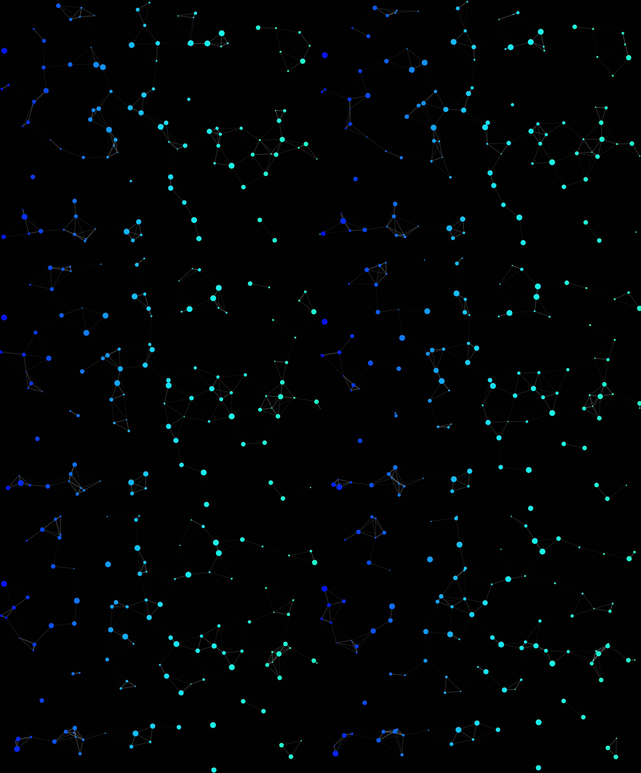
The Particle Screen running inside a Deneb visual — adjustable particle count, colour, and behaviour
Typography: less is more
Power BI reports often end up with inconsistent typography — different font sizes on every chart title, a mix of bold and regular weights used without a clear hierarchy, and labels that are either too small to read or so large they compete with the data.
The simplest upgrade: pick one font and use two weights. DIN, Segoe UI (the Power BI default), or any clean sans-serif works. Use the regular weight for body and axis labels, and the bold or semibold weight for headings, KPI values, and anything you want to read first. That's usually enough hierarchy for most dashboards.
Size matters more than weight variety. A KPI number at 32pt and its label at 11pt creates clear hierarchy without needing different typefaces. Most Power BI reports use too small a size for primary numbers — bumping KPI cards up to 28–36pt significantly improves scannability from a normal viewing distance.
Consistent sizing
- One size for KPI values (28–36pt)
- One size for chart titles (13–15pt)
- One size for axis labels (10–12pt)
- One size for supporting text (10–11pt)
Consistent weight
- Bold for primary numbers and headings
- Regular for labels and supporting text
- Avoid italic except for specific annotations
- No mixing of unrelated fonts
Where to start
If you're looking at an existing report and trying to decide where to begin, the changes with the biggest visible impact for the least effort are:
- 1
Change the canvas background
Swap the white background for a dark tone or a light neutral. This single change has a bigger impact on perceived quality than almost anything else. Set visual backgrounds to transparent so the canvas colour shows through.
- 2
Turn off borders and gridlines
Go through each visual and remove the border. Turn off major gridlines or reduce their opacity significantly. This alone removes a lot of visual noise.
- 3
Reduce to two or three colours
Override the default colour palette with a custom theme. Pick one primary accent colour and use greys for everything else. Consistency matters more than the specific colours you choose.
- 4
Increase KPI font sizes
If you have KPI cards, increase the number size to at least 28pt. Big primary numbers read immediately from a distance and signal confidence in the data.
- 5
Add spacing between visuals
Move elements apart. Add padding inside cards. Even a small increase in breathing room makes a layout feel less crowded and more considered.
Once the basics are in place, going further with custom Deneb visuals — unique chart types, animated elements, or branded components — is much easier to justify and harder to get wrong, because the foundation of the design is already solid.
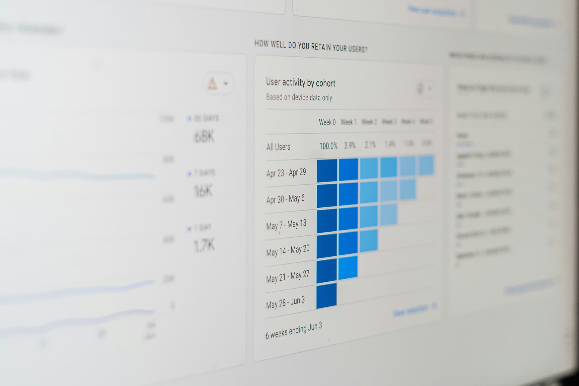
Consistent spacing, a limited palette, and no unnecessary borders — small changes that compound quickly
Add a live animated visual to your report
Customise the Particle Screen live on the product page — particle count, colour, speed, and canvas size — then copy the spec straight into Deneb.
One-time purchase · Instant access · Use in unlimited reports