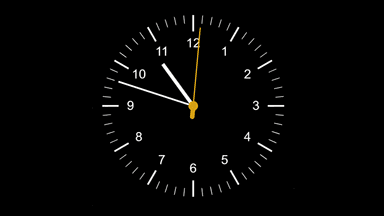
The case for a live clock
Most Power BI reports are built around data that changes on a schedule — a daily refresh, an hourly import, or an on-demand pull. The data has a timestamp. The report has a "last refreshed" label. Time is already baked in.
So why would you add a clock?
For most reports, you wouldn't. A standard analytical report — sales performance, budget tracking, HR metrics — doesn't benefit from knowing what time it is right now. The data tells the story and the timestamp is enough.
But there's a specific category of Power BI use — dashboards that are watched rather than browsed — where a live clock stops being decorative and starts being genuinely useful. Operations boards. Monitoring screens. Displays that run all day, viewed by people who are making time-sensitive decisions.
That's the distinction worth understanding before you add one.
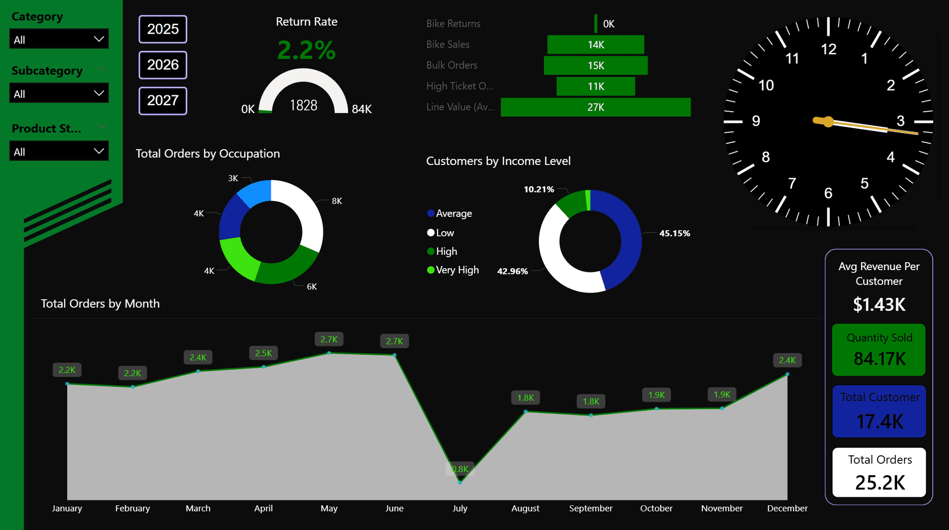
Dashboards that run on screens all day are the strongest use case for a live clock
When it genuinely fits
The clearest signal that a live clock belongs in a report is when the person viewing it cares what time it is right now, not just when the data was last updated.
That sounds simple, but it rules out a lot. An analyst reviewing last week's sales in a meeting doesn't need a live clock. A floor supervisor watching throughput on a production line does.
Good fit
- Dashboards displayed on large screens all day
- Operational or monitoring contexts
- Decisions are time-sensitive (shift changes, SLAs)
- The report is always open and always current
- Multi-timezone teams needing shared time reference
Poor fit
- Analytical reports reviewed periodically
- Static exports or PDFs
- Reports where data refreshes infrequently
- Dashboards where time is irrelevant to the story
- Anything primarily read, not watched
Real-world use cases
Here are the scenarios where a live clock consistently delivers value — and why.
Operations and production monitoring
Reception and lobby displays
Trading and finance dashboards
IT and infrastructure monitoring

Operations screens, lobby displays, and finance boards are the strongest real-world fits
Multi-region teams and world clocks
Distributed teams — a company with offices in London, New York, and Singapore — face a subtle coordination problem in shared dashboards. A metric refreshed at "14:00" is ambiguous without a timezone. Is that BST, EST, or SGT?
A world clock panel solves this elegantly. Multiple clocks side by side, each showing a different city's current time, give every viewer immediate context about where their colleagues are in the day. Is the New York office in a morning standup window right now? Is Singapore already past close of business?
This is more useful than it sounds for planning live collaboration — scheduling a shared call, understanding who to escalate to right now, or reading activity patterns in a globally distributed dataset.
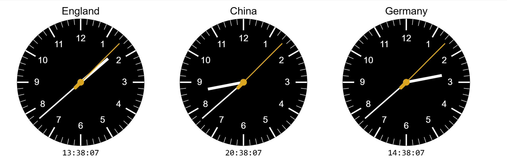
World clock panels are a natural fit for dashboards used by globally distributed teams
Time and data freshness
There's a subtler use case that often gets overlooked: a live clock helps viewers judge data freshness without needing to check a separate timestamp.
Consider a dashboard that refreshes every 30 minutes. If the page shows "Last refreshed: 14:15" and the viewer can see the current time is 14:44, they immediately know the data is 29 minutes old and the next refresh is imminent. Without a live clock, they have to check their phone or system clock and do the mental arithmetic themselves.
This matters most in high-frequency monitoring contexts where the gap between the last refresh and the current moment has operational meaning. A gap of three minutes and a gap of 45 minutes are very different things — and a visible clock makes that gap immediately legible.
Design considerations
Once you've decided a live clock belongs in a report, placement and sizing matter more than most people expect.
Size and prominence
The right size depends entirely on the clock's role. If it's contextual — a supporting element that helps viewers orient themselves — it should be small and tucked into a corner. If it's a centrepiece (a lobby display, a world clock panel), it can be larger and more prominent. The mistake is making it medium-sized: big enough to distract but not big enough to read easily from a distance.
Placement
Top-right is the natural position for a supporting clock — it's where most people look for contextual information and it doesn't compete with the primary content in the centre of the canvas. Bottom-left or bottom-right work well for secondary displays. Centred placement is best reserved for dashboards where the clock is intentionally the headline element.
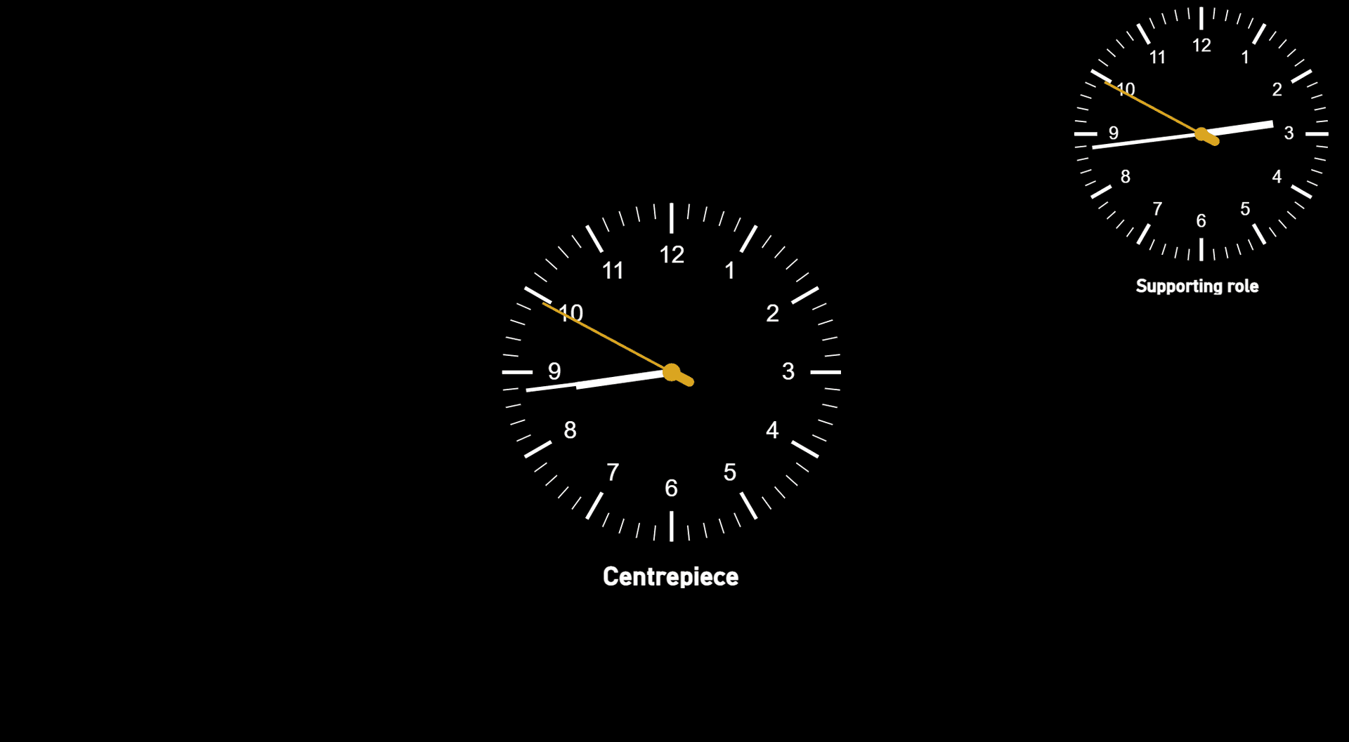
Top-right suits a supporting clock; centred placement works when the clock is the focus
Theme matching
A clock that doesn't match the report's colour scheme will look like an afterthought. For dark-themed operations boards, a black face with white or gold hands blends naturally. For lighter corporate dashboards, a white face with dark hands fits cleanly. The clock should feel like it was designed for the report, not dropped into it.
Second hand — useful or distracting?
A sweeping second hand proves the clock is live, which is reassuring on a monitoring screen. But on a busy dashboard, constant motion in the corner of the screen pulls attention away from the data. If the clock is small or in a supporting role, hiding the second hand is often the better call. If it's larger and the "liveness" is the point, keep it.
When to skip it entirely
A live clock added for aesthetic reasons, rather than functional ones, usually ends up being the thing someone asks you to remove six months later.
If the report is primarily used in meetings — presented from a laptop, shared on a Teams call, exported to PDF — a clock adds visual noise without adding information. The meeting has its own temporal context.
If the data only refreshes once a day, a live clock can actually be misleading. A viewer seeing 3:47 pm next to figures from this morning's refresh might reasonably assume the data is more current than it is. In this case, the refresh timestamp alone is more honest.
And if you're adding it because you saw it in a demo and it looked impressive — that's understandable, but worth being honest with yourself about. A clock that earns its place will be one your users notice when it's missing, not one they scroll past.
A ready-made solution
If you've decided a live clock fits your dashboard, building one from scratch in Deneb is possible but time-consuming — getting the hand angles, sweep animations, and scaling right involves a fair amount of Vega maths.
The Live Clock Gauge is a complete, ready-to-paste Vega spec built for exactly this. You copy it into Deneb and the clock is running immediately. Every visual property — face colour, hand styles, tick marks, timezone offset, optional digital readout, date, title, and subtitle — is exposed as a named variable at the top of the spec, so customising it to match your report takes minutes rather than hours.
There's also a live interactive preview on the product page where you can adjust every setting and see the result before buying — which makes it easy to validate that the clock will look right in your specific theme before you commit.
See it before you commit
Try the live interactive preview on the product page — adjust colours, timezone, labels, and more in real time before buying.